- Engage C&M
- Brand
- Campus Communications
- Media & News
- Social
- Web
- Events Calendar
Colours
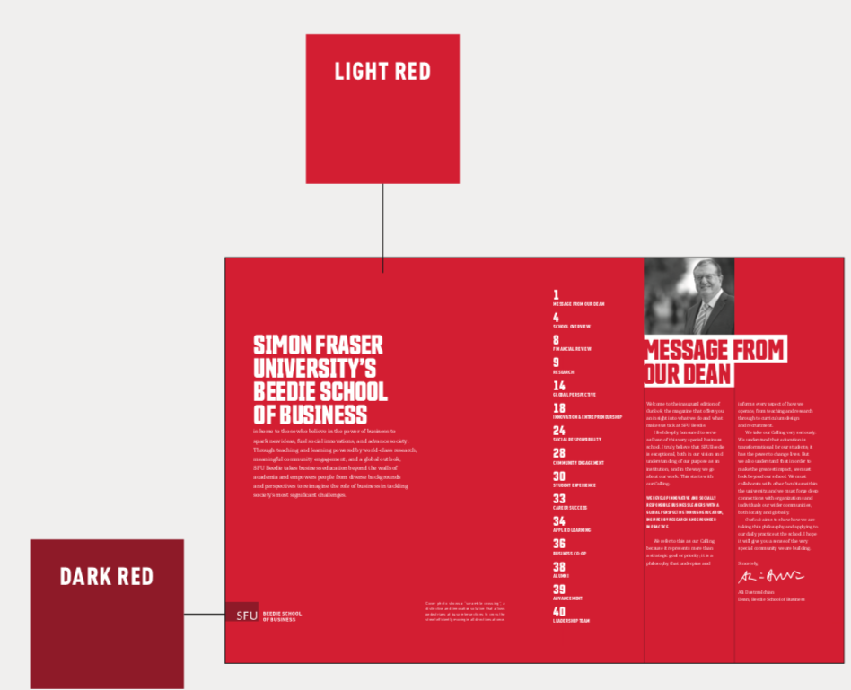
The SFU colour palette is inspired by the red within our logo. It is designed to create a bold, unified and memorable look.
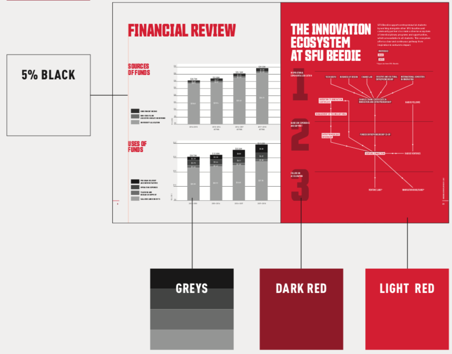
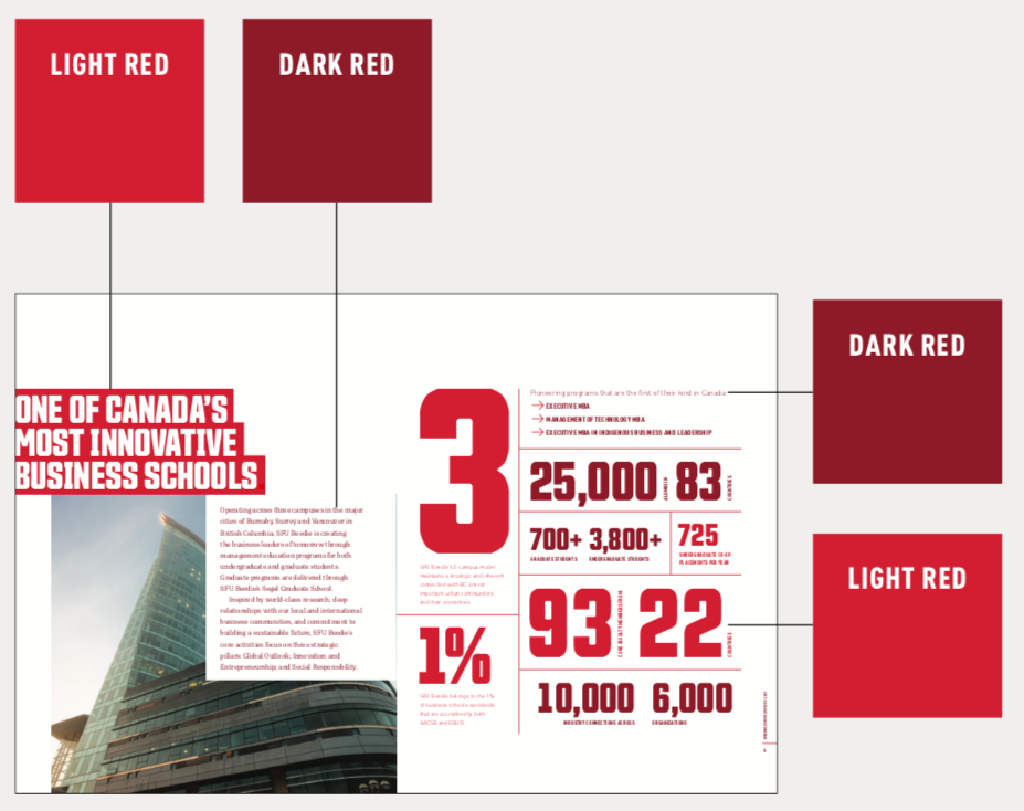
Primary Colour: SFU Light red

SFU light red is our primary colour, to be used as the dominant colour in all applications. Use it for dominant background fields, headers, call-outs and graphic elements.
Spot colour printing: PMS 199C
Full colour printing: CMYK C0 / M100 / Y82 / K0*
Digital applications: HTML#CC0633* or RGB R204/G6/B51*
*CMYK, RGB and HEX have been customized to achieve the best representation of PMS 199.
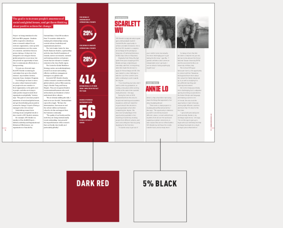
Secondary Colour: SFU Dark Red

SFU dark red and SFU light red are designed to work well together, creating a distinctive tone-on-tone effect. Use SFU dark red in our institutional logo, subheads, call-outs, secondary background fields and graphic elements.
Spot colour printing: PMS 187C
Full colour printing: CMYK C7 / M100 / Y82 / K26
Digital applications: HTML#A6192E or RGB R166/G25/B46
Supporting Colour: Dark Grey

Use SFU dark grey in the text portion of our academic unit and extension logos. You can also apply it to subheads and graphic elements. Use black for body copy.
Spot colour printing: PMS 425C
Full colour printing: CMYK C0 / M0 / Y0 / K80
Digital applications: HTML#54585A or RGB R84/G88/B90
We also use any percentage of black (grey tones). These are useful when designing complex charts and diagrams that need contrast between numerous variables. When designing more complex charts and diagrams you can use screens of the two reds. Sometimes, we use five per cent black as a background to highlight and define areas of copy, such as sidebars.

Black

Use black in body copy.
Spot colour printing: Pantone Process Black
Full colour printing: CMYK C0 / M0 / Y0 / K100
Digital applications: HTML#000000 or RGB R0/G0/B0
Colour Usage
Take a look at the design of a few spreads from a multi-page brochure for an example of how you can use colour. The dominant use of red is an important part of what makes our brand distinctive.