
- Engage C&M
- Brand
- Campus Communications
- Media & News
- Social
- Web
- Events Calendar
Page Types
Page types are templates to assist in building your website layout and navigation. Each SFU-branded template contains default elements such as a header, a navigation bar, and a footer. Some pages are available for specialty content like news pages, faculty profile and blog pages.
For more information about creating a new page see Basic Authoring.
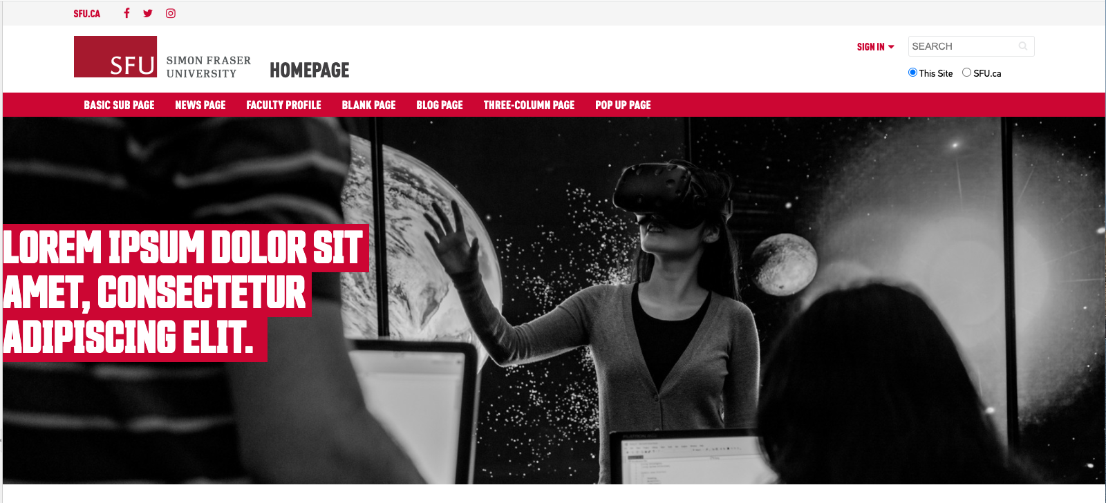
Basic Home Page
The homepage template is the main landing page of your website.
Follow the design guidelines to organize and layout different sections on the homepage.

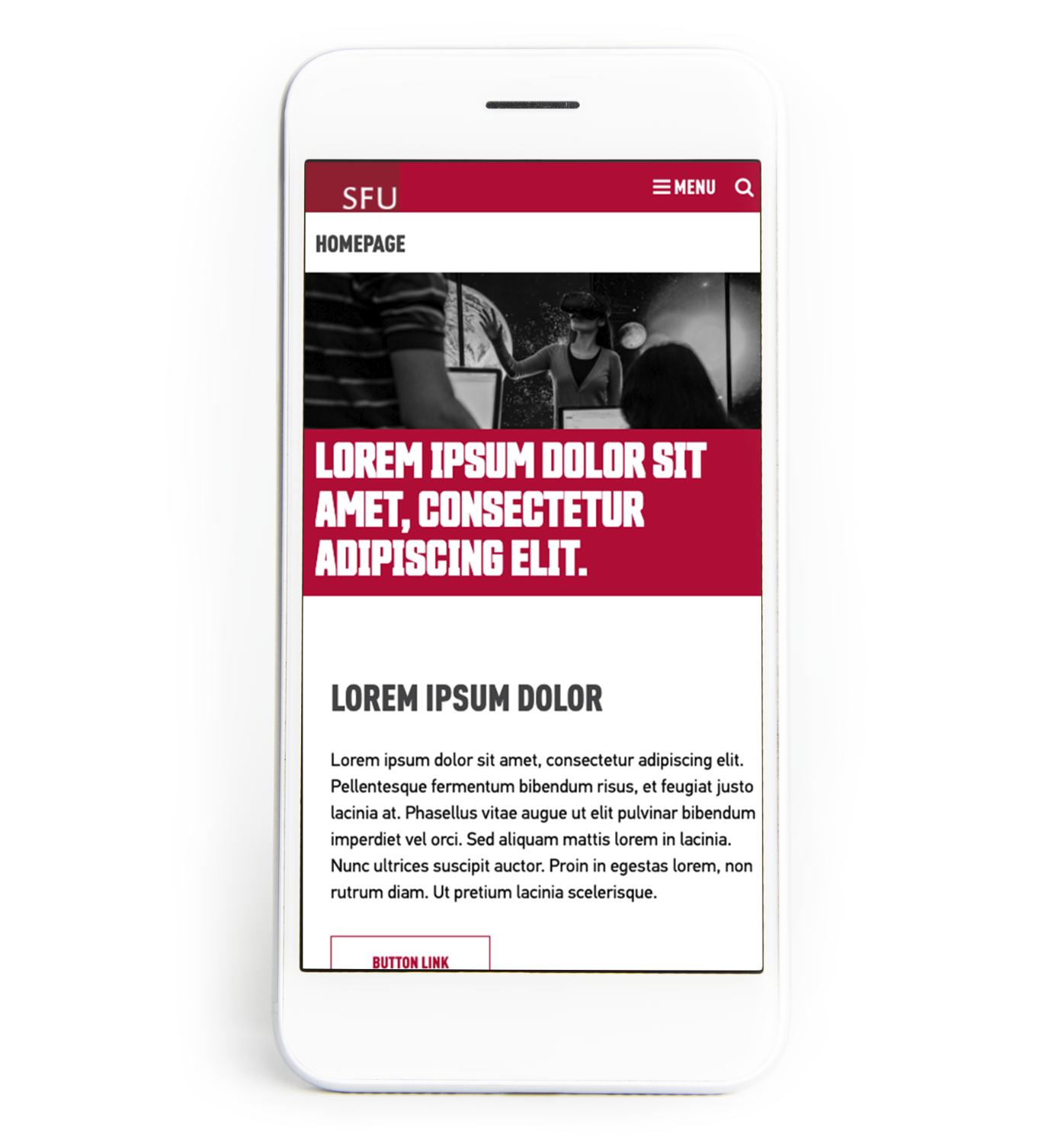
Design Guidelines
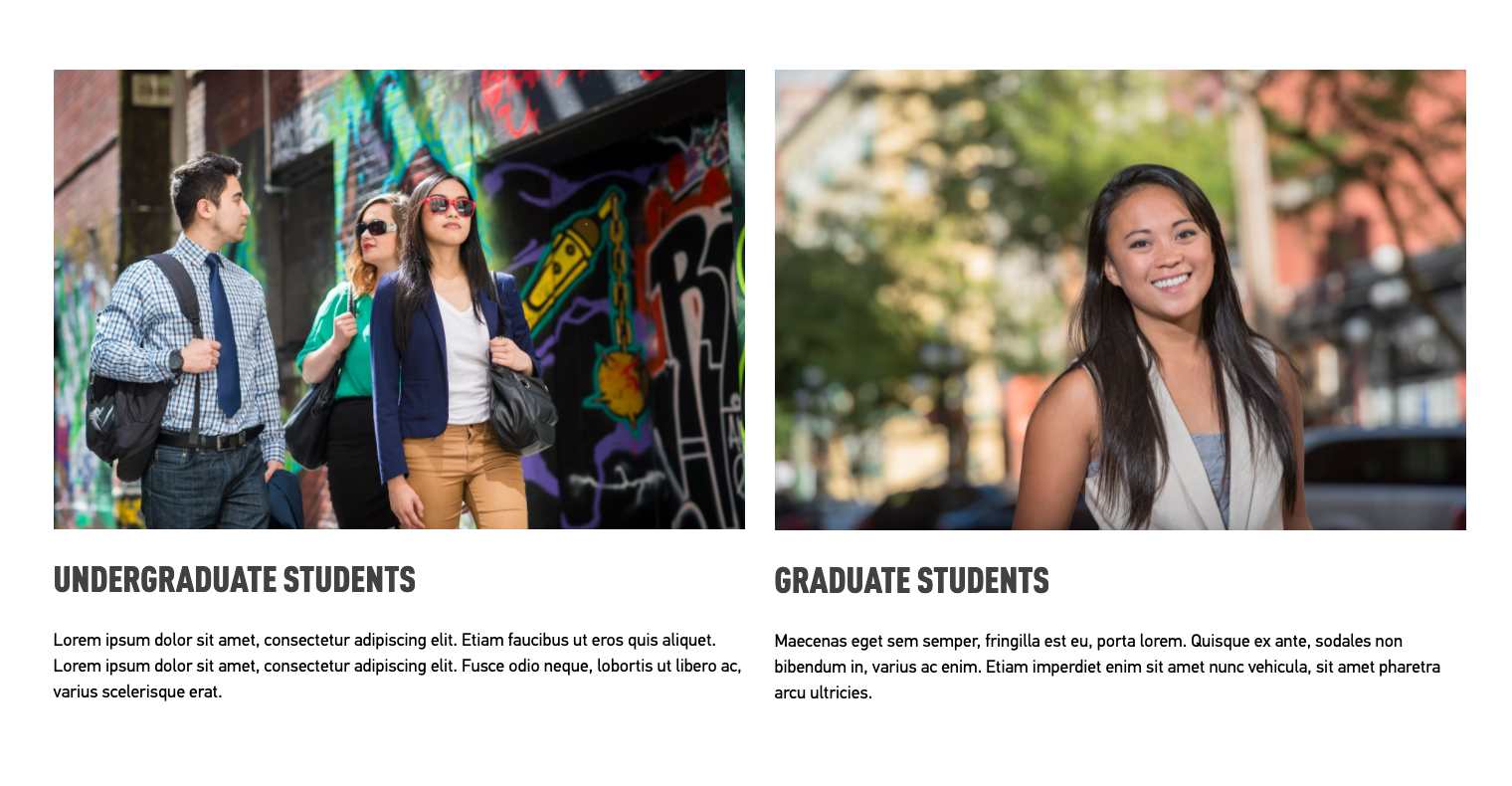
Columns
Two or three column content
- Add column control component and set to two or three columns of equal weight (50/50, 33/33/33), add text or images into each column.
- If adding images, make sure they are same dimension (use crop function if needed).
- If you add text, make sure they are similar length.
Four column content
- Add column control component and set to four columns. This layout can be used for buttons or sponsor logos.

Banner images
Banners and headline images at the top of the page should be set to full width.
Banner images should be cropped to 3:1 ratio.
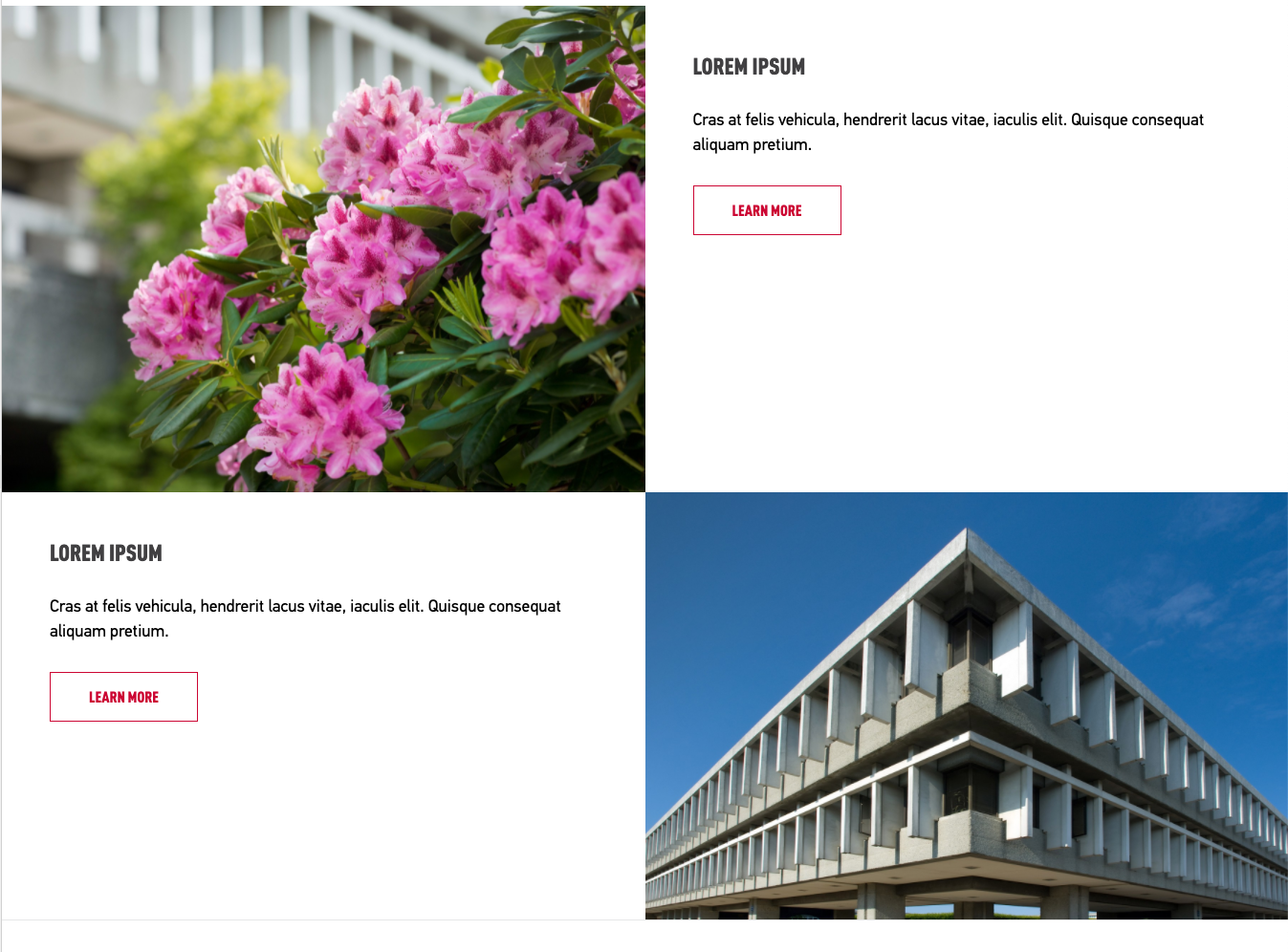
- leftBanners with text can be set up in a two-column layout. Image or overlay banner on the left side and text in the right column.
- The two columns should be set up in full width and no spacing.
- Pad-all style should be applied to the text component in the right column.
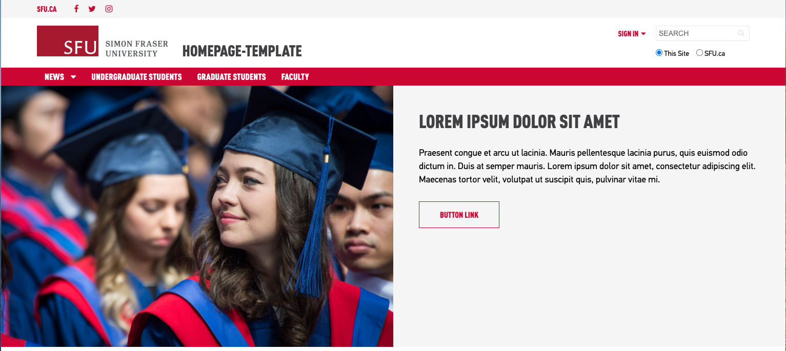
- Overlay or Overlay-bottom can be used as a set of buttons positioned in three or four columns
Divider lines
- Add a separate column control component, with class styles ruled or ruled-thin and margin-top margin-bottom
- Place divider lines between sections of content.
Alternating images
- Checkerboard images are set up in a 2-column layout.
- Images used in one column should be set to "full width" and "no spacing".
- Any text content added into the alternating column will need padding style pad-all
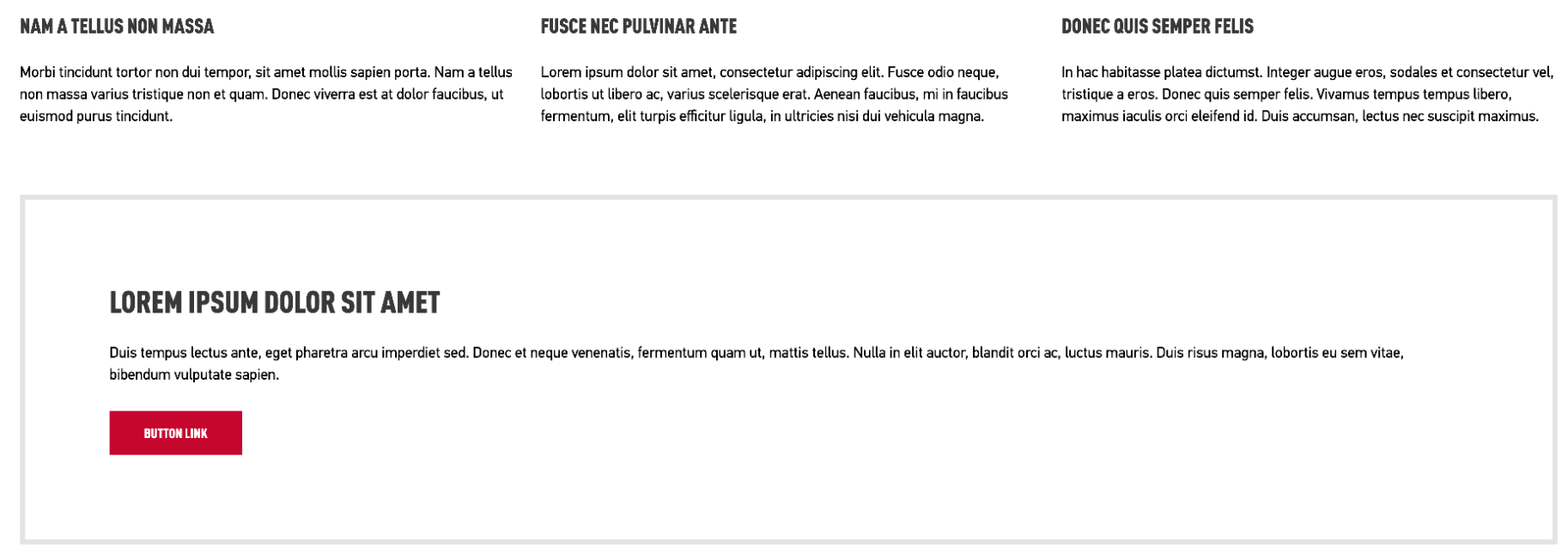
Outlines & coloured boxes
Important notices or coloured backgrounds red or grey block should include a pad-all style
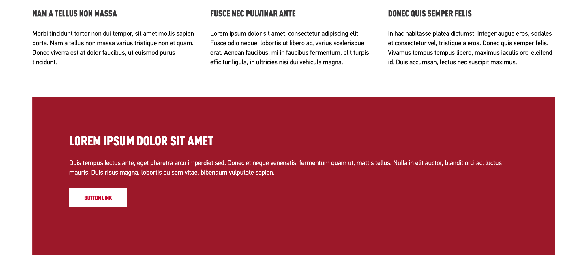
- coloured backgrounds on homepages can also be set to "full-width" to expand the width of the page
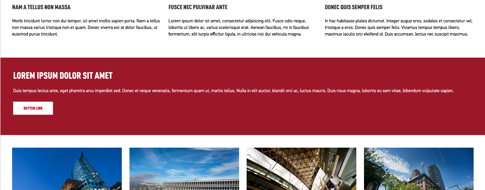
- Outline boxes content do not need any additional padding
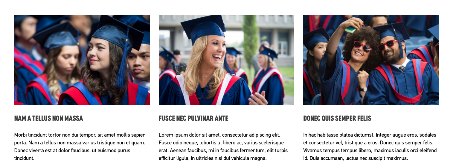
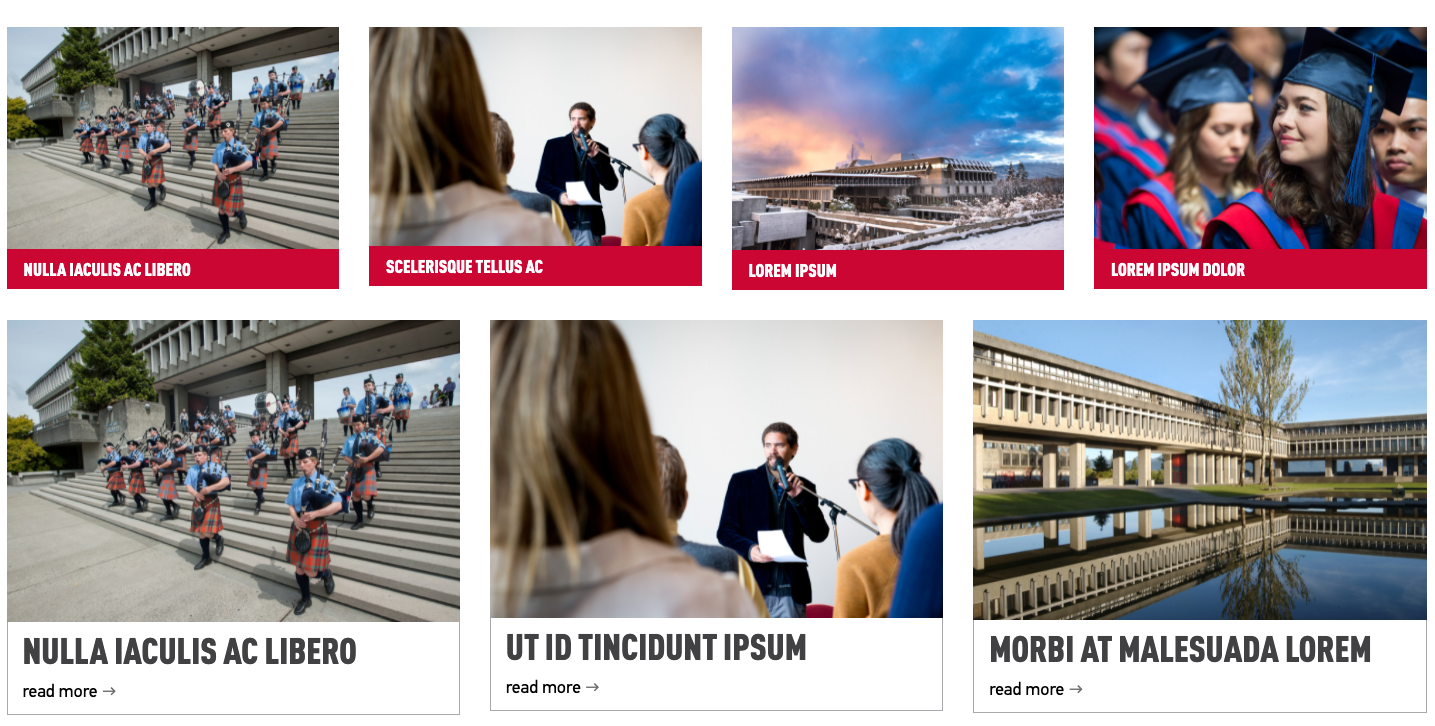
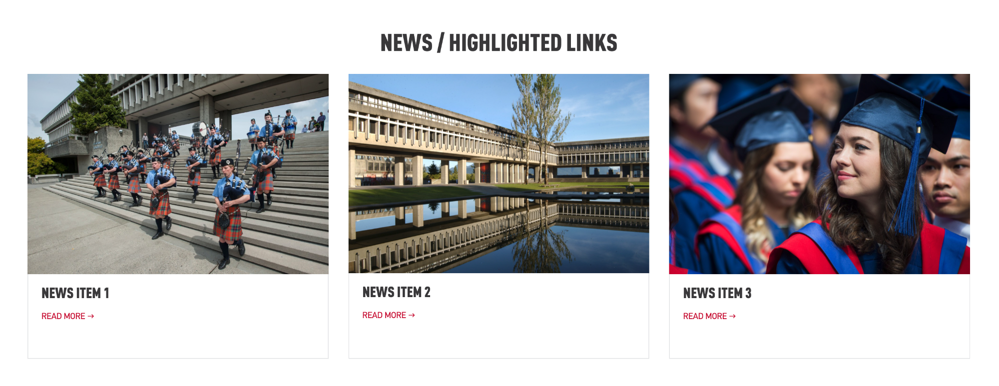
News Items
Three cards display
- Add a column control component with one column.
- Add the list component into a column control component and set the list component to display as cards and limit of three items
- Add the style for three columns col-3
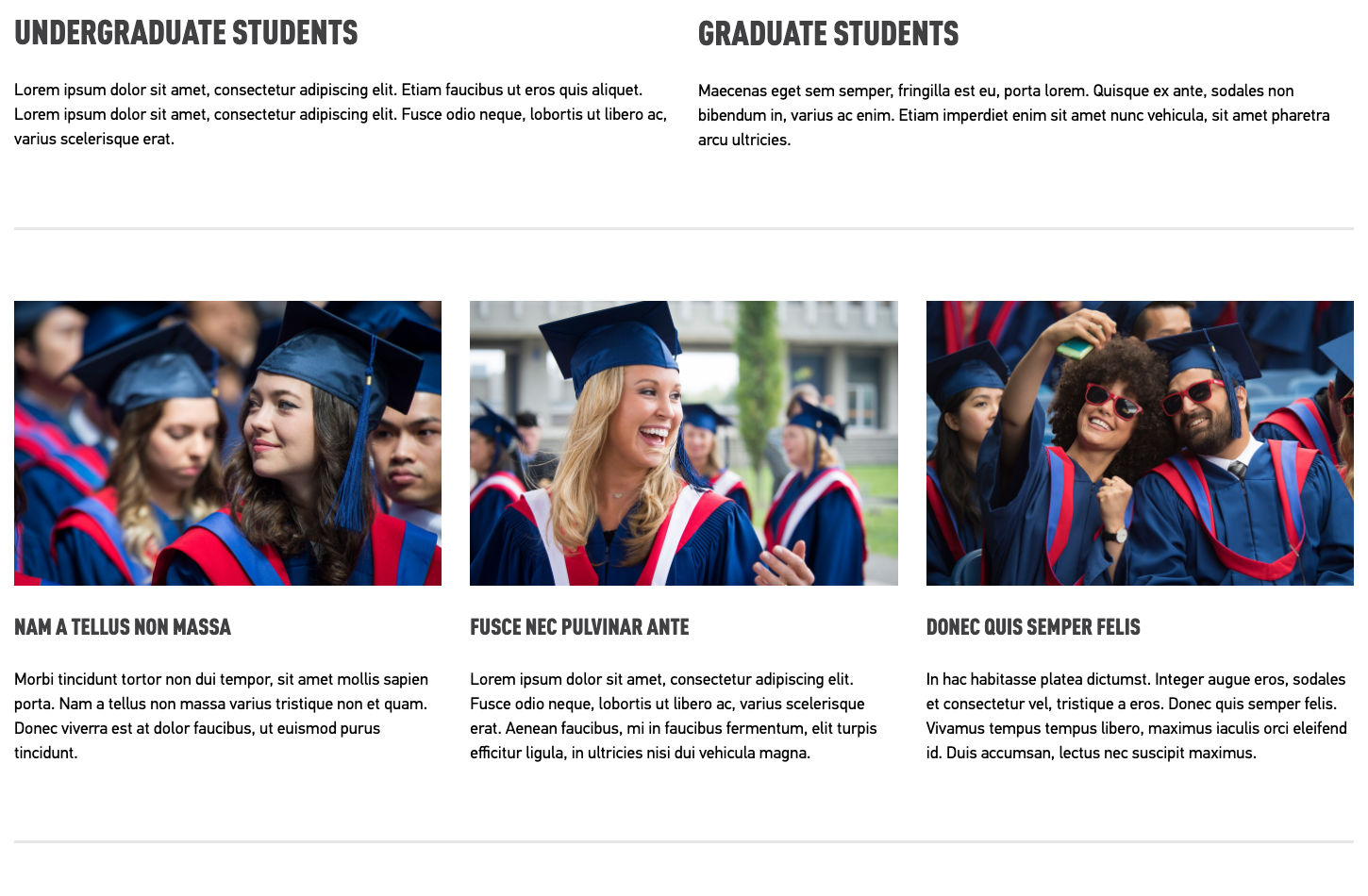
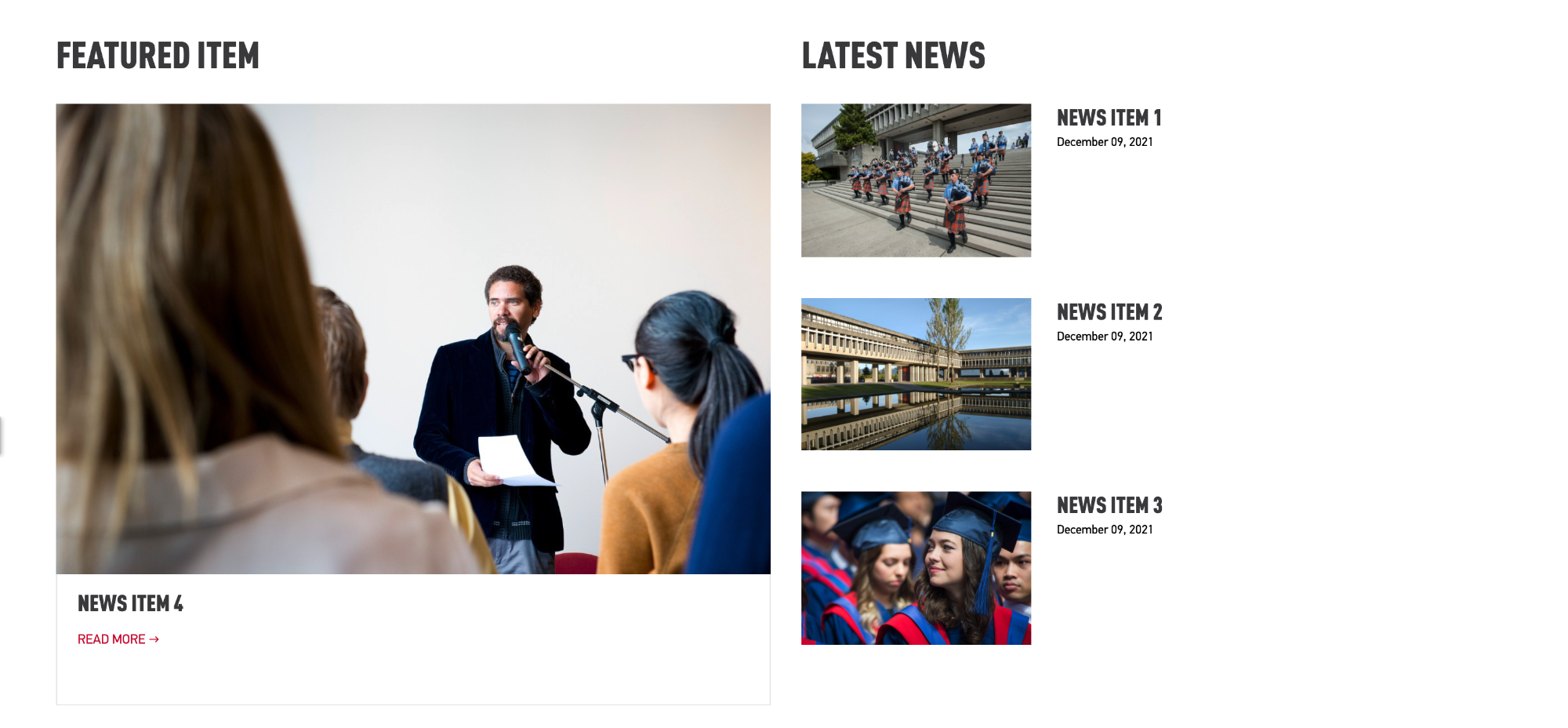
Two column display with one featured story and a list of news items
- Add a column control component set to two columns.
- On the left column add a list component, display as a card and set to limit of one.
- On the right column add a list component, display as configurable view
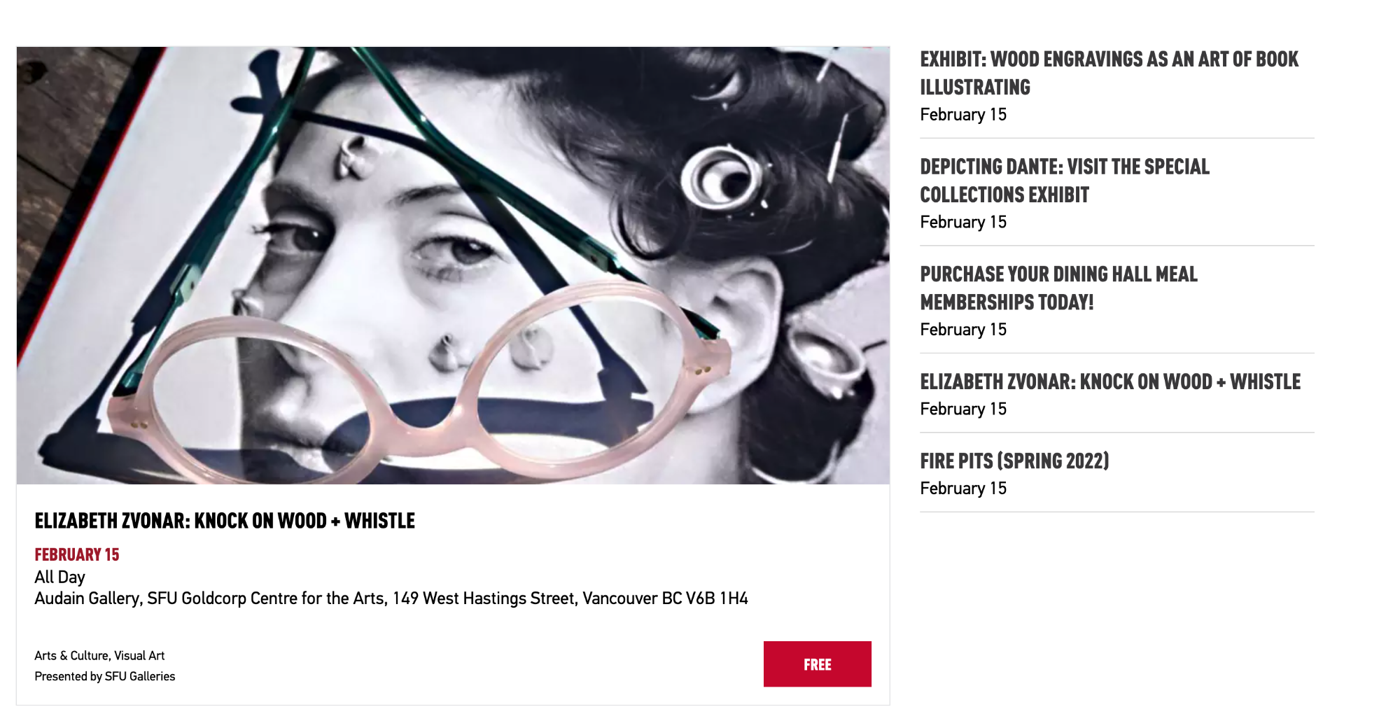
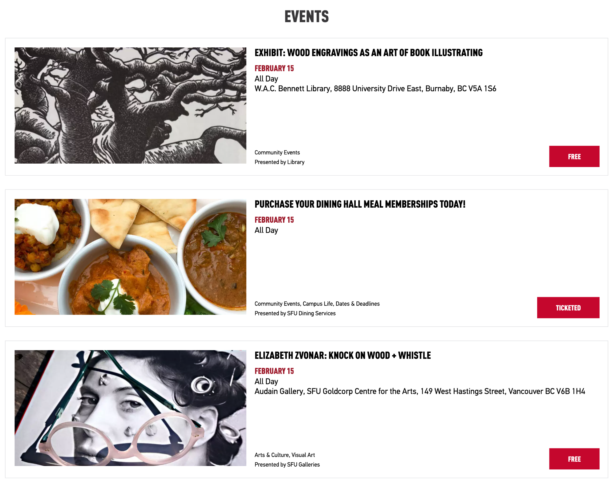
Events
Events List
- To display a list of events in the Livewhale component set display as a "Detailed events list" with a limit of three items
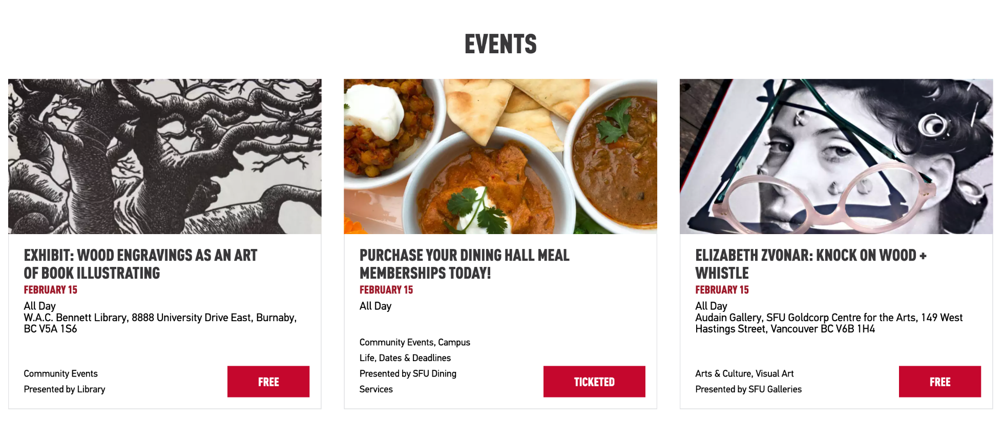
Events Cards in columns
- To display as cards in columns, set Livewhale as “SFU Events Calendar layout” and place in a one column component with pad-all class applied
Events in two columns
- Add a two column component to the page.
- In the left column add the livewhale component as a “Detailed events list” with a limit of one
- In the right column add livewhale component as a "Simple events list" with a limit of four to five items.