
- Engage C&M
- Brand
- Campus Communications
- Media & News
- Social
- Web
- Events Calendar
Links & Buttons
Links can be added to your content through hyperlinks in your text, more links, and buttons. Having a CTA (call-to-action) on your page keeps your user engaged and provides the user with an action to do such as “sign-up now” or “register for a course”.
Text Links & Buttons
Buttons
Best Practices
Naming a link:
- Describe where the link will direct the user, such as “Visit the Beedie School of Business website”) instead of using terms as “click here” or “visit site”
- Using strong action words, and command verbs to direct users
- Ex. Subscribe, sign up, Donate, Join now, Download PDF
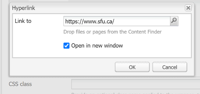
External links:
Always open external links outside of the SFU domain in a new window
Do Not Link:
Avoid links in the following areas to keep a CTA (call-to-action) that is accessible, easy to scan and informative:
Headers (Heading 1 – Heading 5)
Within a quote
Within hidden toggle content
Images, if an image uses a link include a descriptive alt tag
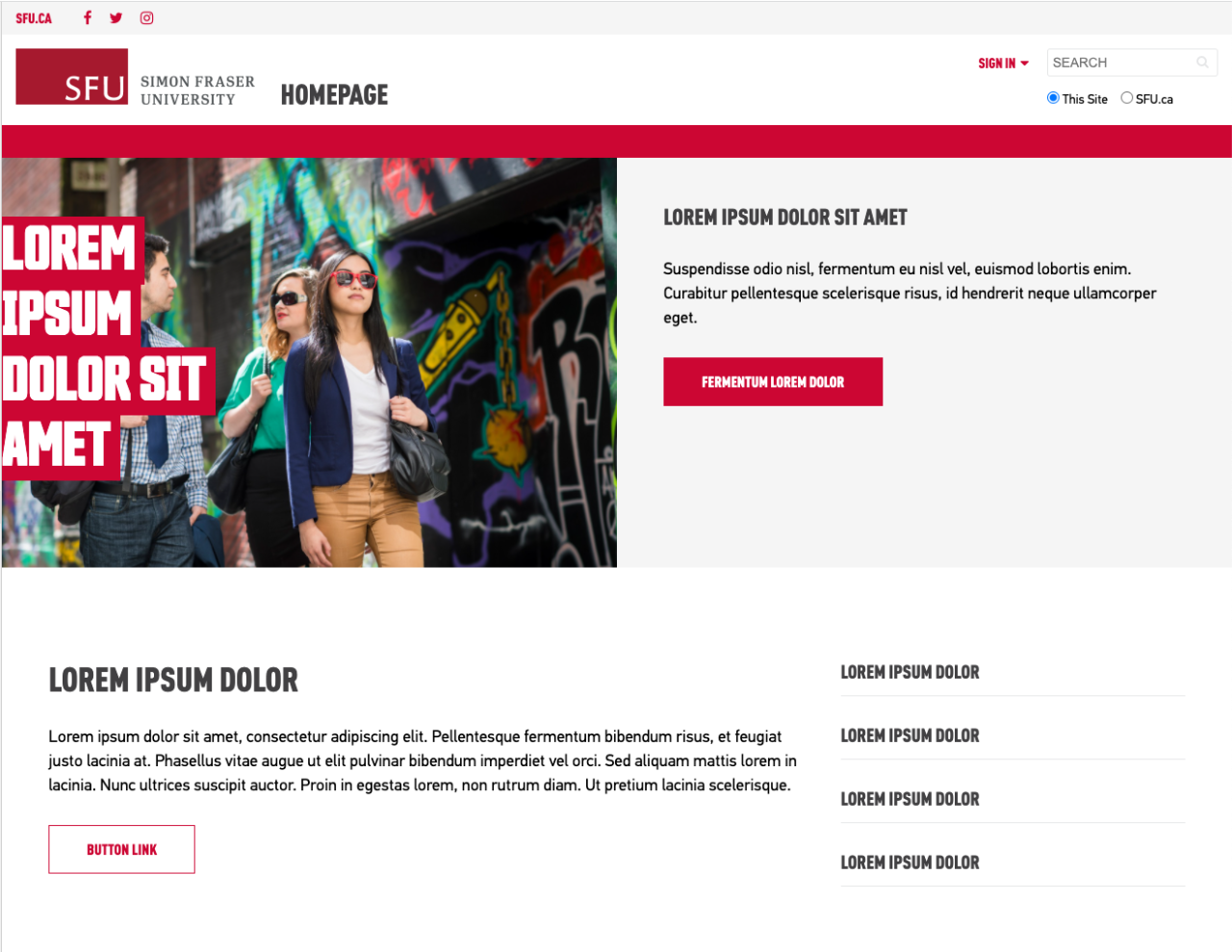
- Paragraph text link on a red background, please use a button style instead
Tips:
- Use broken link checker to find all your sites broken links.
Design Guidelines
Using the styles correctly in your design:
More Link
- A more link should be positioned at the end of a paragraph, or other text
Buttons
- Buttons can be placed on their own or placed below a paragraph
White button
- is used for moderately important links
Red button
- is used for most important links
- Is used on text and image overlay banners
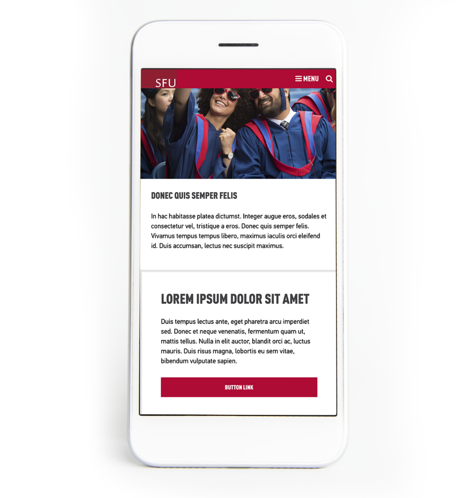
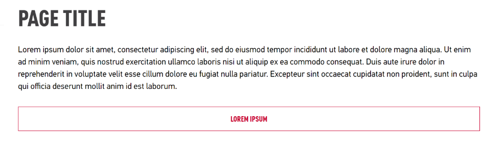
Full width button
- Is best used on narrow columns or mobile screen sizes
- Never use a full width button on a wide screen window

How to
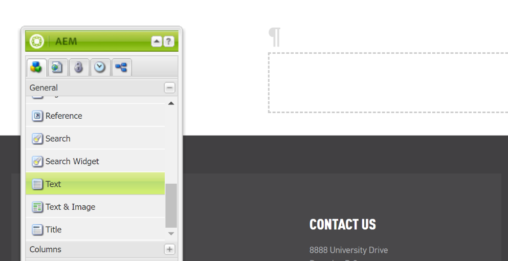
1. Open your text component or text and image component, by double clicking or right click to edit
2. Highlight the text you want to create a link with and select the hyperlink button
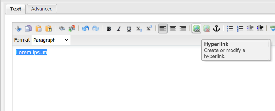
3. In the dialogue window add the URL to the link to field
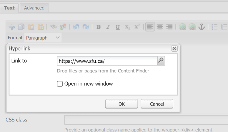
4. For external links to open in a new window, select the checkbox for open in new window (see best practices)
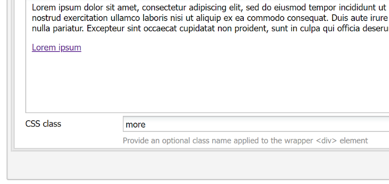
5. To add "more" link style:
Place hyperlinked text at the end or below your paragraph
type “more” to the CSS Class field
The last link in your text component will be styled as a more link, and any previous links will remain as regular text links
6. To add "more-all" link style:
Place hyperlinked text at the end or below your paragraph
type “more-all” to the CSS Class field
Any links in your text component will be styled as a more-all link.
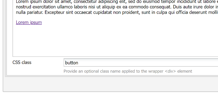
7. To add a "button" style:
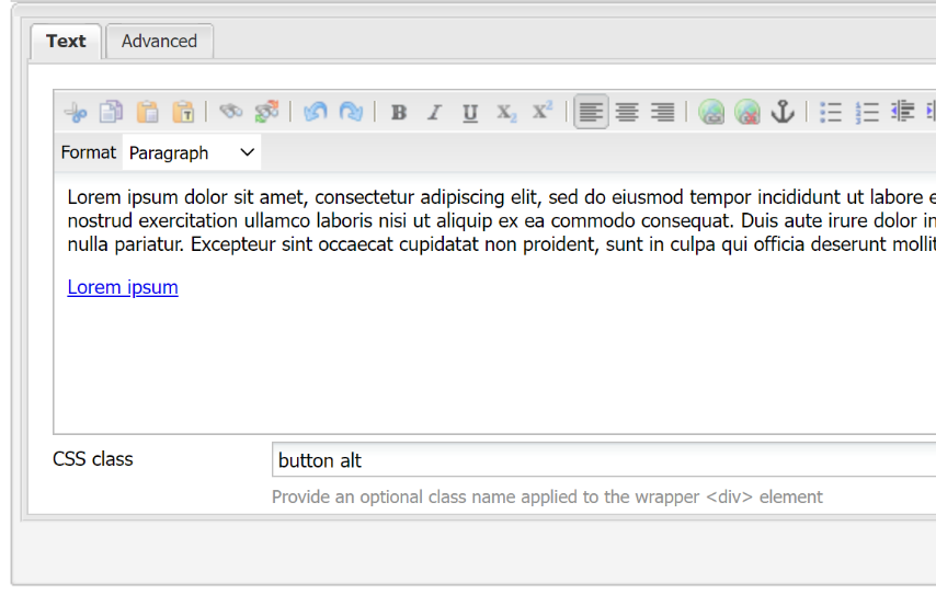
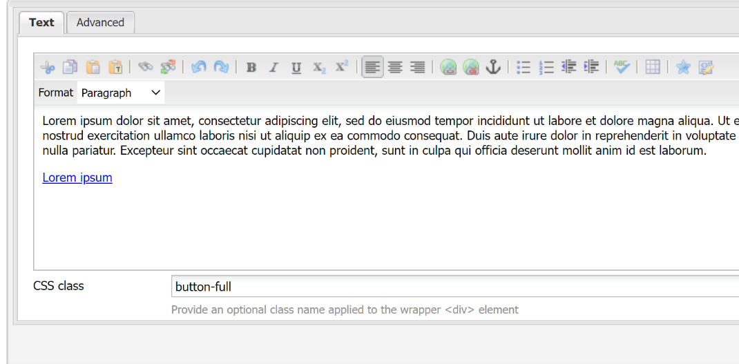
Type the button style from the list below into the CSS Class field
Styles:
- button
- button alt
- button-full
- button-full alt
Note: If you add class “button” to a text component, all links will be converted to a button. You may need to create separate buttons by placing a separate text box and link for each button. You can also add a button below a paragraph.
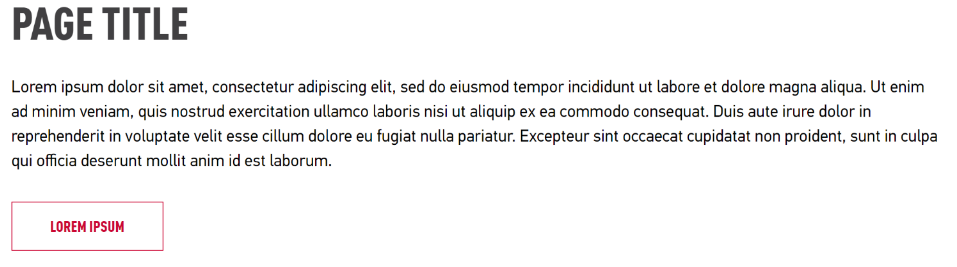
button alt
- Turns a hyperlinked paragraph text into a red call-to-action button.
- The width of the button depends on the length of copy.
On Hover:
- The button goes from solid red to transparent with a red border.
- On a red background the button is solid white and turns transparent with a white border on hover.
- On grey background the button is solid red and turns transparent with a red border on hover.

button-full
Turns a hyperlinked paragraph text into a white / transparent button that stretches to the full width of the column.
On Hover:
The button goes from transparent with a red border to solid red.
On a red background the button is transparent with a white border and turns solid white on hover.
On grey background the button is transparent with a red border and turns solid red on hover.
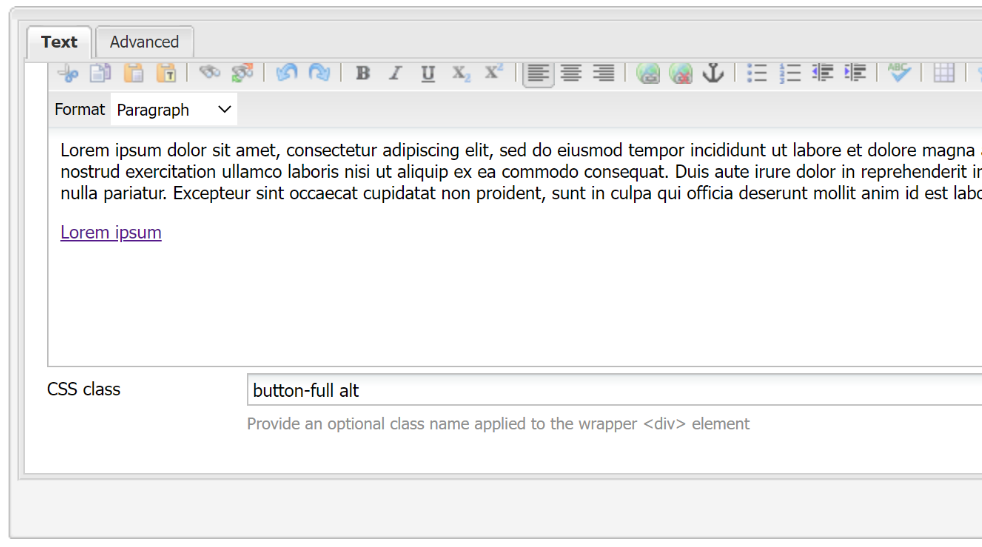
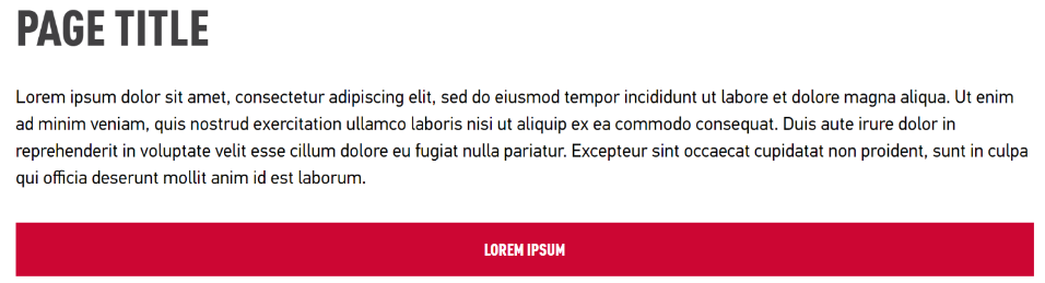
button-full alt
Turns a hyperlinked paragraph text into a red button that stretches to the full width of the column.
On Hover:
The button goes from solid red to transparent with a red border.
On a red background the button is solid white and turns transparent with a white border on hover.
On grey background the button is solid red and turns transparent with a red border on hover.
Resources
To create a list of buttons, see List Component, to automatically generate a list of button links.