
- Engage C&M
- Brand
- Campus Communications
- Media & News
- Social
- Web
- Events Calendar
Designing for Different Screen Sizes
Content is automatically adjusted for different screen sizes to make it accessible for tablets, mobile devices or desktop computers. You can also customize your page layout for these different screen sizes by:
Customizing layouts to stack earlier on smaller screen sizes (tablet or mobile screens)
Hiding components on certain screen sizes (desktop, tablet or mobile)
Add padding only on certain screen sizes (desktop, tablet or mobile)
Display Styles
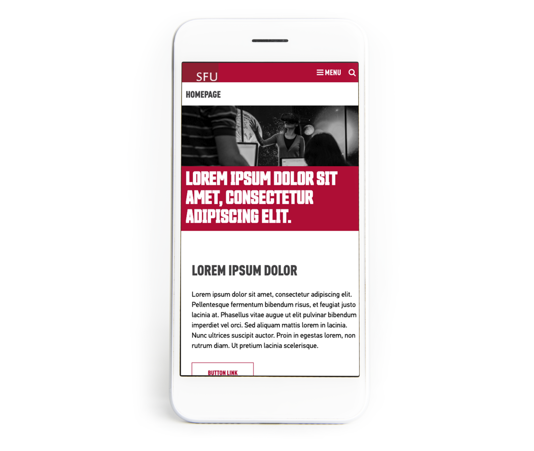
Mobile – Browser width – up to 768px
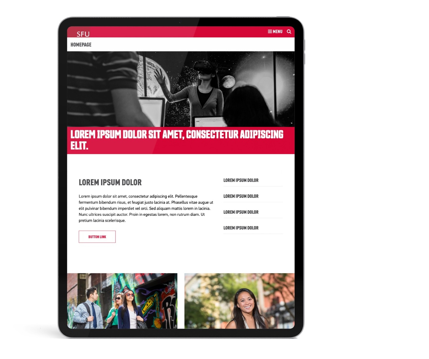
Tablet – Browser width – 768 to 980px
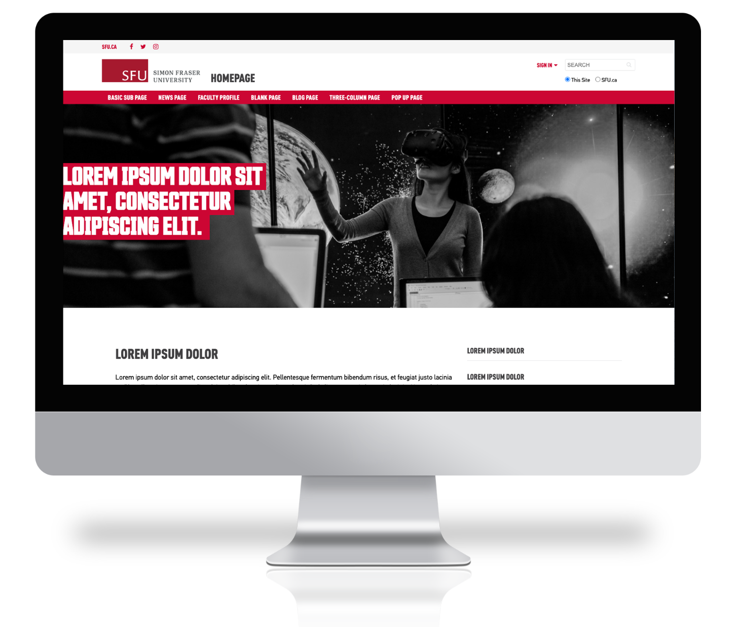
Desktop – Browser width – 980px and above
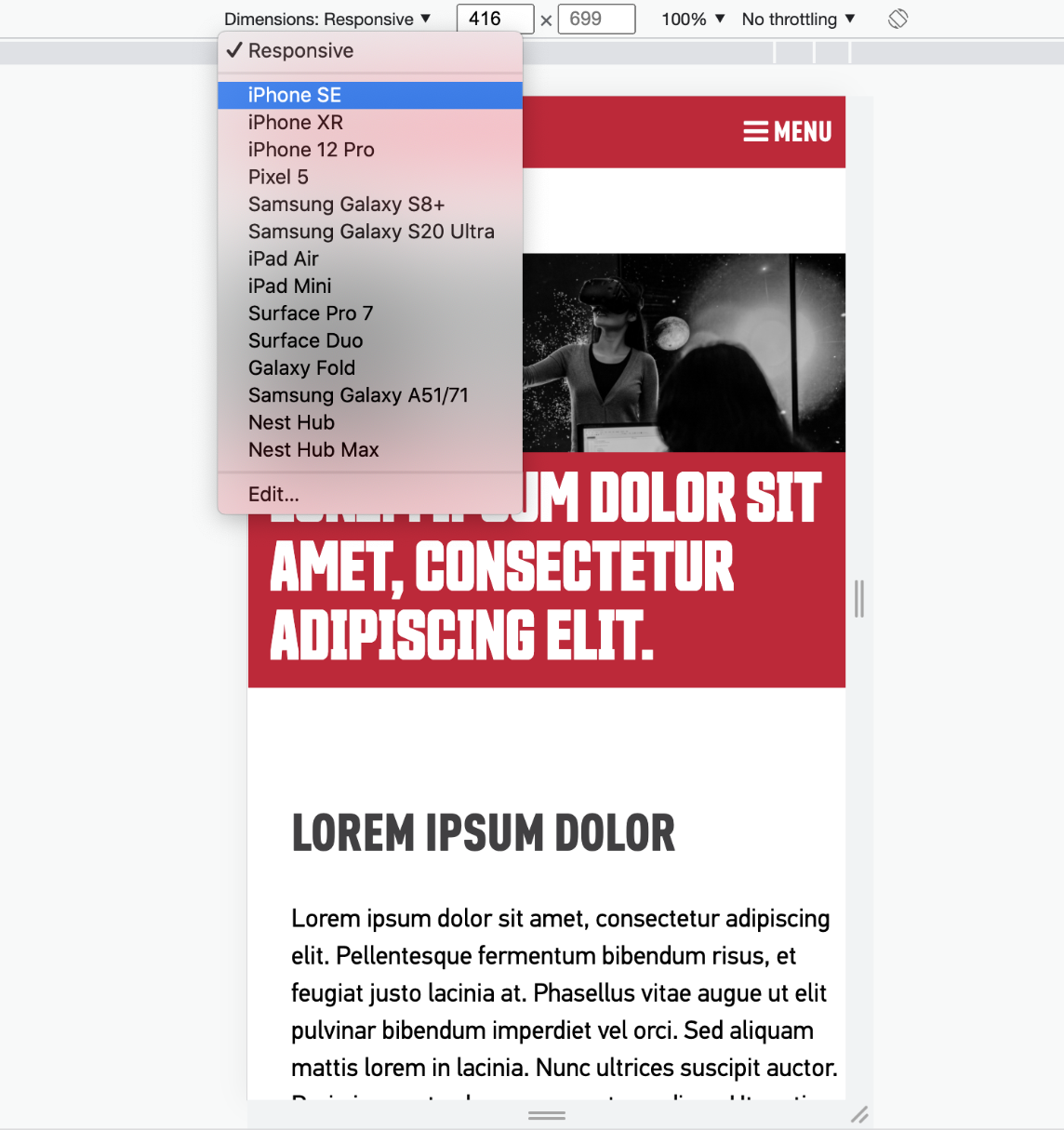
Preview in mobile or tablet view
To preview your site at different screen sizes you can either:
- Move one side of the browser window to expand or shrink the window to replicate the size of a mobile browser window.
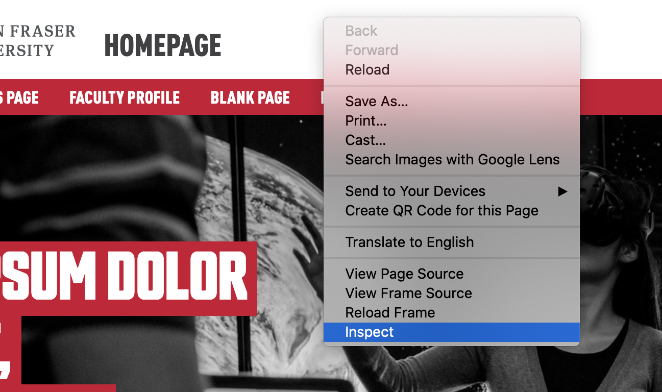
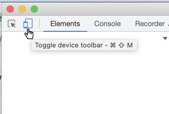
- Use the inspect option of your browser window (Chrome).
- Right click on your website page and select “inspect” from the list.
- Click on the “Responsive Design Mode” icon to enable mobile views.
Best Practices
- When previewing your site always consider what your site looks like in small screen devices as well as on desktop computers.
- Check for components that need to be stacked if your content is crowded at a narrow size and adjust by applying stacking classes
- Check that the padding on all elements is consistent throughout your site, on mobile or desktop screen size. Add padding to components if needed for mobile.