
- Engage C&M
- Brand
- Campus Communications
- Media & News
- Social
- Web
- Events Calendar
Typography
Our brand includes standard and system fonts with specific styling. Consistent application is key to effective expression.
Standard Fonts
Standard brand fonts should be used for marketing collateral and branded communications where possible, especially external-facing communication.


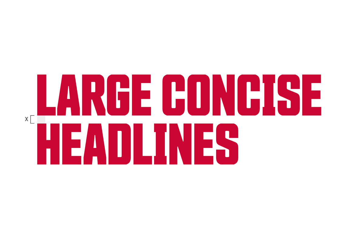
Countach
- Used for: Large and concise headlines
- Font: Countach BOLD
- Case: All caps, do not use sentence case
- Size: Larger than 30pt
- Colour: SFU light red or white, do not use black
- Linespacing: 86% of font size
- Alignment: Left or right. Bleed off the same page whenever possible
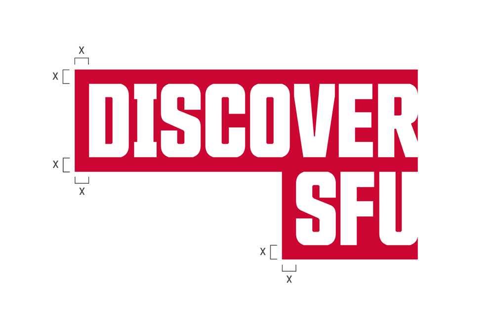
Countach title bars
We often contain titles and headlines within graphic bars that are inspired by the design of the institutional SFU logo. Title bars are optional and offset text the same distance as the set linespacing.
November
- Used for: Subheads, call-outs, calls-to-action
- Fonts: November Condensed Heavy, Regular Heavy, Regular
- Case: All caps, sentence case and title case
- Colour: SFU dark red or black
- Linespacing: 120% of font size
- Alignment: Left or right aligned, avoid centre align
Subhead 1
- Font: November Condensed Heavy
- Case: All caps
- Colour: Dark red
- Linespacing: 120% of font size
Subhead 2
- Font: November Condensed Heavy
- Case: Title case or sentence case
- Colour: Black
- Linespacing: 120% of font size
Subhead 3
- Font: November Condensed Heavy
- Case: Title case or sentence case
- Colour: Dark red
- Linespacing: 120% of font size
Subhead 4
- Font: November Condensed Heavy
- Case: All caps
- Colour: Black
- Linespacing: 120% of font size
- Letterspacing: 120
Sidebar and Captions
- Font: November Regular, Bold where appropriate
- Case: Sentence case
- Colour: Black
- Linespacing: 150% of font size


Using subhead styles
- Subhead titles should be formatted in title case, ie. “Reports & Publications.”
- Subhead headlines and sentences should be formatted in sentence case, ie. “SFU Continuing Studies launches new Climate Action Certificate program.”
- Subhead and paragraph styles are sized relative to each other.
- Adobe Experience Manager (AEM) styles are hard-coded and optimized for web display.
Lava
- Used for: Body copy and call-outs
- Font: Lava Regular
- Case: Sentence
- Colour: Black
- Linespacing: 150% of font size
- Letterspacing: 0
- Alignment: Left

How to obtain standard fonts
- Standard desktop licenses are available to SFU Communicators whose main duties include graphics production.
- Licenses are attached to individuals and managed by Communications & Marketing. When licensed font users change, the license must be returned or transferred.
- Please email sfu-brand@sfu.ca to request, return or transfer licenses.
- Once licensed, Communicators will receive a font pack that includes they styles used in our typography guidelines, e.g. November Heavy. SFU licensed fonts include First Nations and Inuit characters and symbols and include “FNI” in the font name.
- Do not distribute standard brand fonts.
Working with an external partner
Third party agencies, printers, designers or service bureaus can license individual SFU font styles directly from their respective foundry.
Countach
Purchase from Production Type
November and Lava
Purchase at a 50% discount from Typotheque (TT) one-time perpetual. November and Lava licenses are extensions of the SFU license and valid for SFU work only.
Process
Discounted fonts can be purchased from Typotheque directly at info@typotheque.com
- Identify yourself as a third party for Simon Fraser University.
- Confirm which fonts and styles to license. Styles used at SFU:
- November Regular and Italics
- November Bold and Italics
- November Condensed Heavy and Italics
- Lava Regular and Italics
- Lava Bold and Italics
- Confirm type of license required, e.g. desktop licenses, self-hosted or apps & e-Books. If self-hosted confirm number of monthly page views, e.g. 100k monthly or 5m monthly.
- A sales representative will follow up with payment instructions.