MENU

Typography

Our brand includes standard and system fonts with specific styling. Consistent application is key to effective expression. 
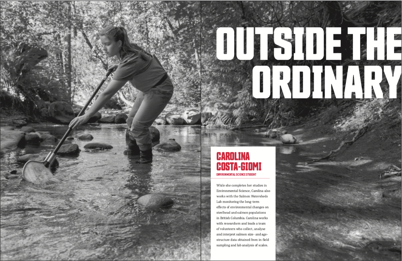
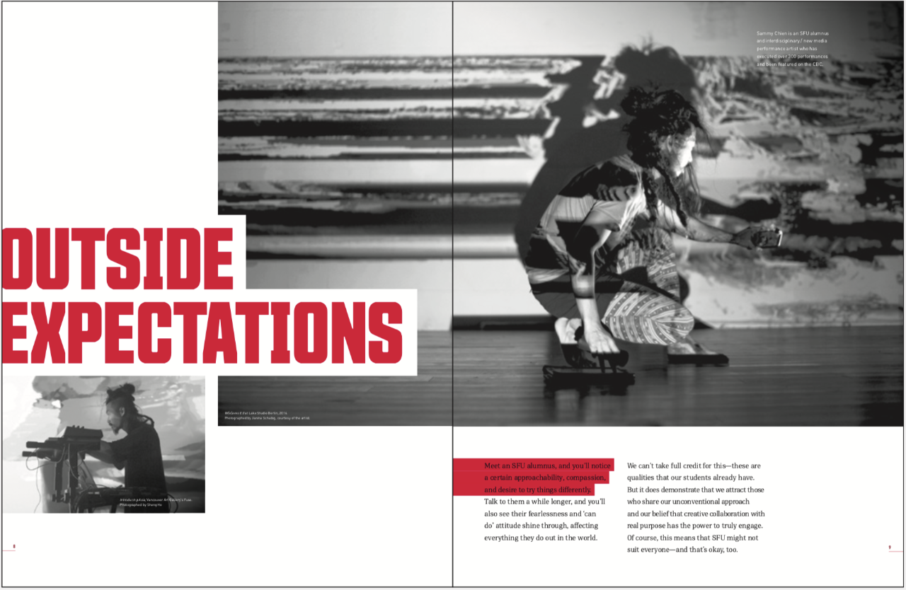
Layout Examples

Here is a range of typographic layout examples that demonstrate this flexibility and provide inspiration for different types of layouts. 

Headlines can simply be set reversed out of an image and in light red on a white background or vice versa. Blocks that contain text and bleed off a vertical or horizontal edge can be introduced to help with legibility and to create a more dynamic layout.
Generous and interesting use of negative space is an important part of SFU layout design. Title bars can be used to create interesting negative spaces in which titles can sit.
Large and bold numbers and words can help enliven content. Alternating between the two SFU reds can also create a sense of texture and rhythm to layouts.
Title bars can bleed into fields of colour to create interesting negative spaces for headlines and copy. When doing so, the edge of the field should align with the baseline or top line of the headline. The title bars must have ascending horizontal lengths moving towards the connecting field of red. Placing the logo and headlines or block of copy on opposing sides of a composition creates a sense of dynamism and balance.