

Campus Project | 2022
March 30 – April 5, 2022 | SFU Burnaby: Academic Quadrangle, Convocation Mall, & adjacent areas
For the first time since 2009, SFU’s School for the Contemporary Arts will return to the Burnaby Campus to present 38 public artworks made by first year visual art students. Each student will install a site-specific artwork dealing with a range of themes that address the campus as a site of knowledge and experience.
The works engage with the campus as faculty, staff and students are just returning to in-person learning. These exciting projects range from video, performance, sculpture, painting, drawing, assemblage, to conceptual work that will reinvigorate a sense of belonging as the audience encounters each unique work during their daily routines.
We believe art is an essential part of public life, especially while navigating the spaces of higher learning. Social, political, and cultural concerns across faculties can be brought to the fore through the visual arts, challenging our preconceived notions of what it means to study at SFU, how we got here, and where we are headed together.
The Campus Project is part of CA 161, taught by Professor Sabine Bitter, working with TA Douglas Watt.
Participating students: Esha Barmi, Regienald Batac, Molly Bergen, Emma Campbell, Ben Chan, Shirley Chen, Zoe Cheng, Caroline Chernega, Amy Dai, Abroop Dhami, Karel Feng, Gracy Gandhi, Sana Goel, Luvz de Guzman, Tracey Ho, Ocean Hongphankul, Julian Injeti, Lauren James-Davies, Carmen Kors, Lily Le, Kari Li, Danhui Liu, Angel Lok, Daniel Molnar, Harvir Nahal, Haruomi Nakajima, Chloe Ng, Sarah Robinson, Moay Sakata, Renan Shao, Michele Shen, Stephanie Shih, Caelan Thorne, Novejit Virk, Daniel Walberg, Evelyn Wang, Freya Zan, and Xinyi Zhao.
www.sfu.ca/~sbitter/campus_project
EVENT
Opening reception & tour
Friday, April 1, 2022 | 2:00 PM – 3:00 PM
Meet in the Convocation Mall, SFU Burnaby
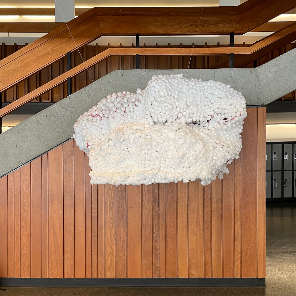
1 ___ Esha Barmi
Fuz
The idea of “Fuz” originates from the feeling of being a student stuck in class. You have to listen you have to focus you have to take note, but all my mind does is wander. The site I choose is in the middle of a busy study area. Everyone is glued to their laptop or notebook or devices and are chaotically studding. I wanted “Fuz” to be a way out. Something fuzzy to look and and to let your mind wander and not focus too hard. To just relax. The form itself is hard. Built with chicken wire and wood it stands as the bone of the cloud. The Cotten on the outside has a soft feeling as is pleasant on the eyes. The interior if colourfully and dreamy to look at with the books and stars flying everywhere. The cloud is cozy, a safe place to think and look. The sculpture itself looks like a cloud as it’s supposed too. It represents the feeling of being outdoors out of the space. As clouds flow so do your thoughts. I titled it ”Fuz”, not because it necessarily looks fuzzy and is, but more because when my mind does wander it feels like Fuz. Like a mess but not. It’s noisy but quiet it’s peaceful but also chaotic. It’s Fuz. There’s no right or wrong way to describe it. When someone sees Fuz I hope it brings calm to them or whatever they want to feel or interpret it as. It’s an open space. There is not an assigned feeling or thought you should feel. It’s supposed to make you feel and think however but this was the reason and way I decided to design it. It’s free. It’s Fuz.
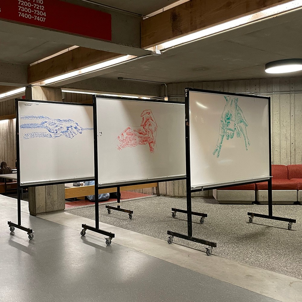
2 ___ Regienald Batac
Three States of Mind
These pieces are a series of detailed, hand gestures made to represent the conscious mind, the subconscious mind and the unconscious mind; as a way to show the three parts of the mind. This was through the use of dry markers. Running through the meaning of these pieces, the conscious mind is what defines any thoughts and actions within our realm of comprehension. Personal awareness dictates what is right and what is wrong from our perspective. An example of this could be telling a white lie to either a stranger, friends, and family for a better outcome to different types of situation or scenarios. I drew crossing fingers as a way to represent a white lie. The subconscious mind defines all reactions and automatic actions we can become aware if we think about them. For example, fidgeting our hands when speaking to someone; I drew the fidgeting hands a means to represent this. This is one of our reflexes of what we do in our everyday life. Lastly, the unconscious mind are repressed feelings, hidden memories, desires, thoughts and reactions. They consist of memories and emotions that are painful, embarrassing, and or shameful. An example of this could be thinking that you’ll never be good enough or amount to anything in the future; I drew these hands grasping on to a rope that snapped to represent that. The way how professors use a whiteboard and a marker to show and reflect their knowledge of their field and pass it on to a younger generation; I used this median specifically for that reason. The fact that this piece could be so detailed, but could be erased with a swipe of a hand signifies how anything blissful comes to an end.
3 ___ Molly Bergen
Spooky
To be completely honest, in learning about contemporary art and seeing examples of it done in school and outside of it, I can't say it's something that I, for whatever reason it may be, particularly enjoy making. It feels overstated in a weird way that tends to leave a lot more questions than answers, it attempts to question and comment on things but very easily falls short of that, even to the point of falling into the same ideas or concepts it was trying to push back on. Whatever the main problems I personally have with it may be, I found it difficult to bring myself to make such a piece. This is why I have decided instead to make a number of smaller pieces, most completely unrelated to any of the other ones, and all with no more description than you will find here as to what they mean or why I chose to make them. Feel free to assign meaning to them as you see fit, should the idea of doing that interest you.
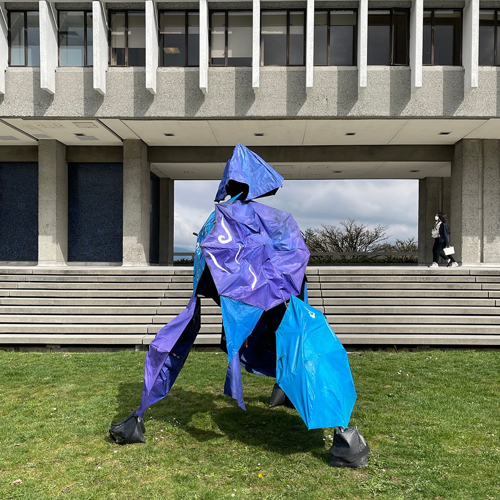
4 ___ Emma Campbell
Wind Charm
This piece has been created using broken umbrellas collected from students at the SFU Vancouver campus. In this work, the idea of being comforted in a hostile environment is explored. It seeks to play with the concept of being protected from the elements, both natural and human. The site where the artwork is located is somewhat detached from the busy streams of university life, and yet, in the geographic center of it. This work hopes to act as an enclave of comfort that gives a vision to the possibility of more outdoor-indoor spaces at SFU. As the wind chimes resonate their tonal frequencies so too does the inner self harmonize with the calm of its surroundings. However, without the umbrellas sheltering the chimes from the full brunt of the wind, they quickly become overstimulating, chaotic and overwhelming. This is similar to how the university can seem, if there is no way to manage its impact. This work seeks to serve as a recentering place: a reminder to check in with oneself before returning back to the sometimes more frenzied parts of the campus.
5 ___ Ben Chan
Osseus
The conception for this sculptural piece is based on the idea of feeling alienated as a student from an educational institution. The sculpture is relatively undefined and left skeletal, to demonstrate the foundation of a life form as well as the internal aspects of a body, which often hide away true emotion or unshared feelings. There’s a contrast between the aluminum bar and the clay, the clay being rough, textured and collected from the earth while the aluminum, smooth and machine made. These two materials, when bound together, present the theme of modernized technology and its relation to the human form, which continue to be evermore inseparable. Originally, Geiger and N Melstran’s works inspired this piece, with both artists similarly combining technology and bio naturalism in similar alien-like artworks. The location of this piece is specific, that being outside of the Shrum Science Building connected to the AQ. The reasoning for this location is to again, connect to science, but also by placing the work just outside of the main corridor, it incorporates a barrier between the sculpture and the student body, which, while appearing transparent, is also impenetrable.
6 ___ Shirley Chen
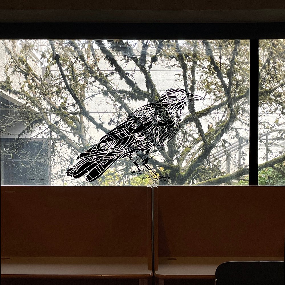
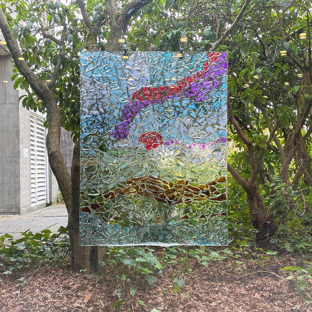
Take Us Back
Take Us Back is a series of drawn hand gestures and toys displayed on the windows of a lecture hall on the east side of the AQ. The artwork represents the lamentation of adulthood and longing for returning to childhood. The hands cradling various toys portray the existential angst of growing old and losing the childish wonders of their carefree adolescence. Each hand will lovingly cradle a toy to symbolize cherishing and nurturing their childhood memories. The original planned placement in Saywell Hall symbolizes the fleeting moments of childhood, how childish moments must leave as people venture into adulthood. Users of Saywell Hall often include the schools of Criminology, Archaeology, FASS, First Nation Studies, and Psychology. This site was specifically chosen for its humanities background in human history and psychology, as those 2 themes play a large role in this art piece. The hallway the piece will be situated specifically is a part of the building with window walls and illustrations of birds printed on them. Saywell Hall is also commonly used as an intermediate path to other buildings because it is located close to the SFU bus loop. People often venture through Saywell Hall with a hyper fixation on attending class, and thus do not stop to take in the site’s structure. However, there are seating areas available (mostly for studying) so people can sit with the installation for a while and engage with it. Students sitting in front of the installation show that while their minds focus on the present, their childhood memories (and possible subconscious longing for adolescence) still exist. Therefore, the heavy circulation adds to the theme of human perception of time and memories.
7 ___ Zoe Cheng
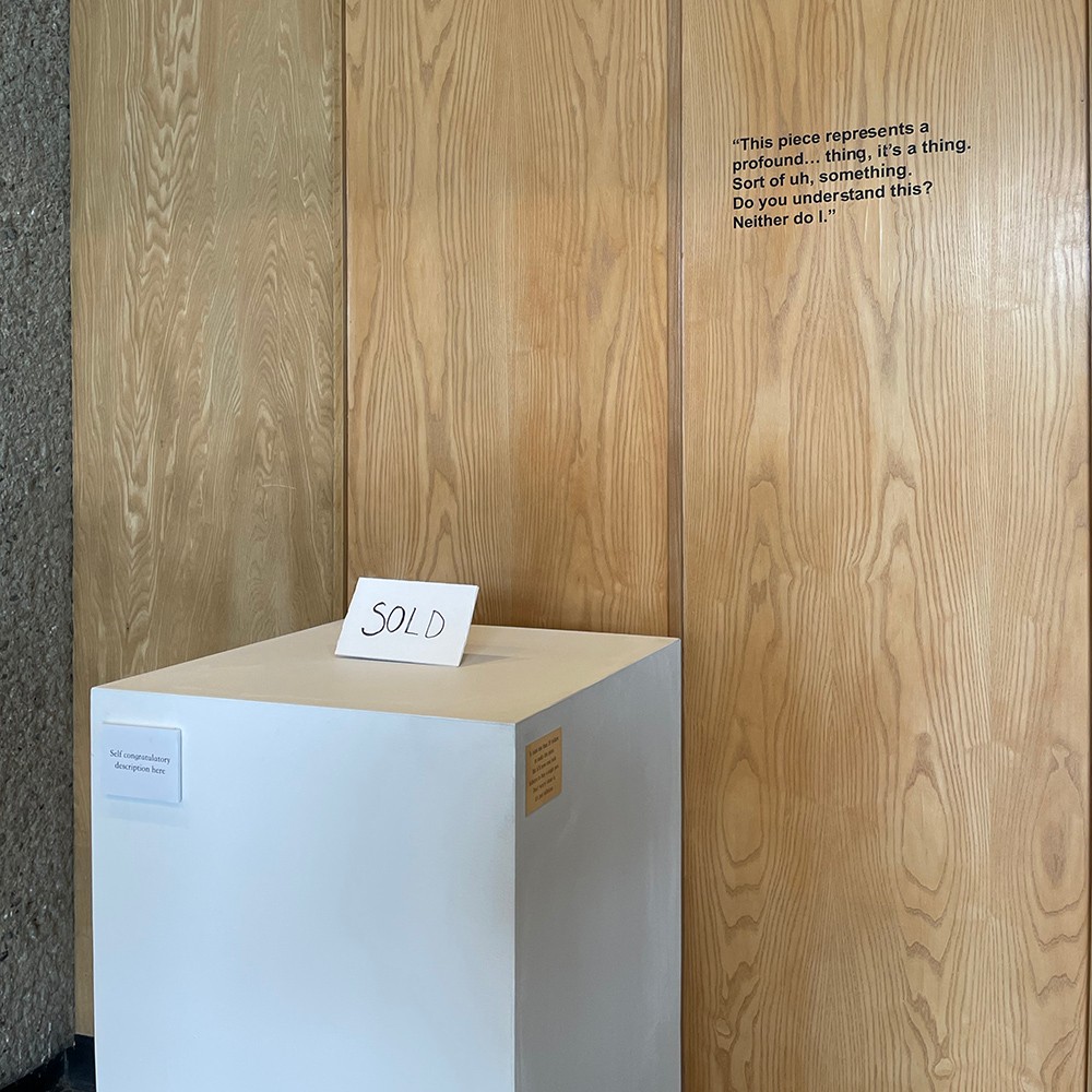
Sold
Sold serves as a multidimensional pastiche piece, a site specific to the critiquing the gallery system at large. This sculptural piece pushes the boundaries of sculpture by combining pastiche with elements of readymade, and is meant to address the concept of the gallery system and how art is presented in the public space in a humorous manner. Upon first glance, the piece may feel incoherent, but the dissonance is tied together by its direct visual reference to the traditional gallery format: with every art piece, you might see a small artist description, a curatorial statement to accompany the collection, and a metal plaque to thank the sponsors and donations to the gallery. The pastiche visuality is combining all of these elements into the same space, adapting the element of visuality into Sold, only to end it all with a sign that indicates that the piece has been “sold”. This piece pokes fun at how the site purpose and the sculpture’s aura sometimes clashes, yet sometimes it’s so much that, instead of evoking sincerity. Pieces that evokes an air of insincere pretentiousness, creating works that’s illegible to the general public despite being for the public. The centrepiece that wrote “sold” is also connected to the idea of submitting oneself and one’s creative integrity to extreme commercial intent.
8 ___ Caroline Chernega
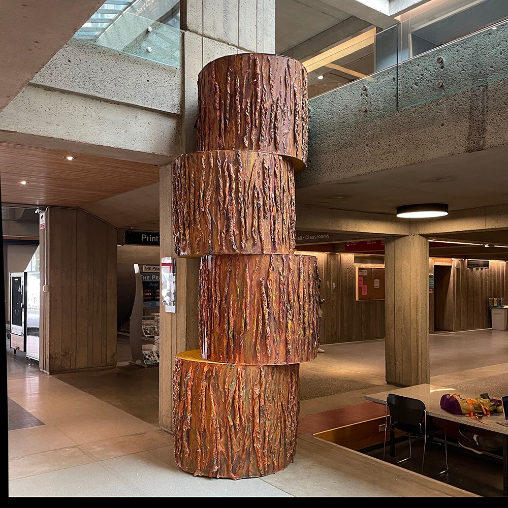
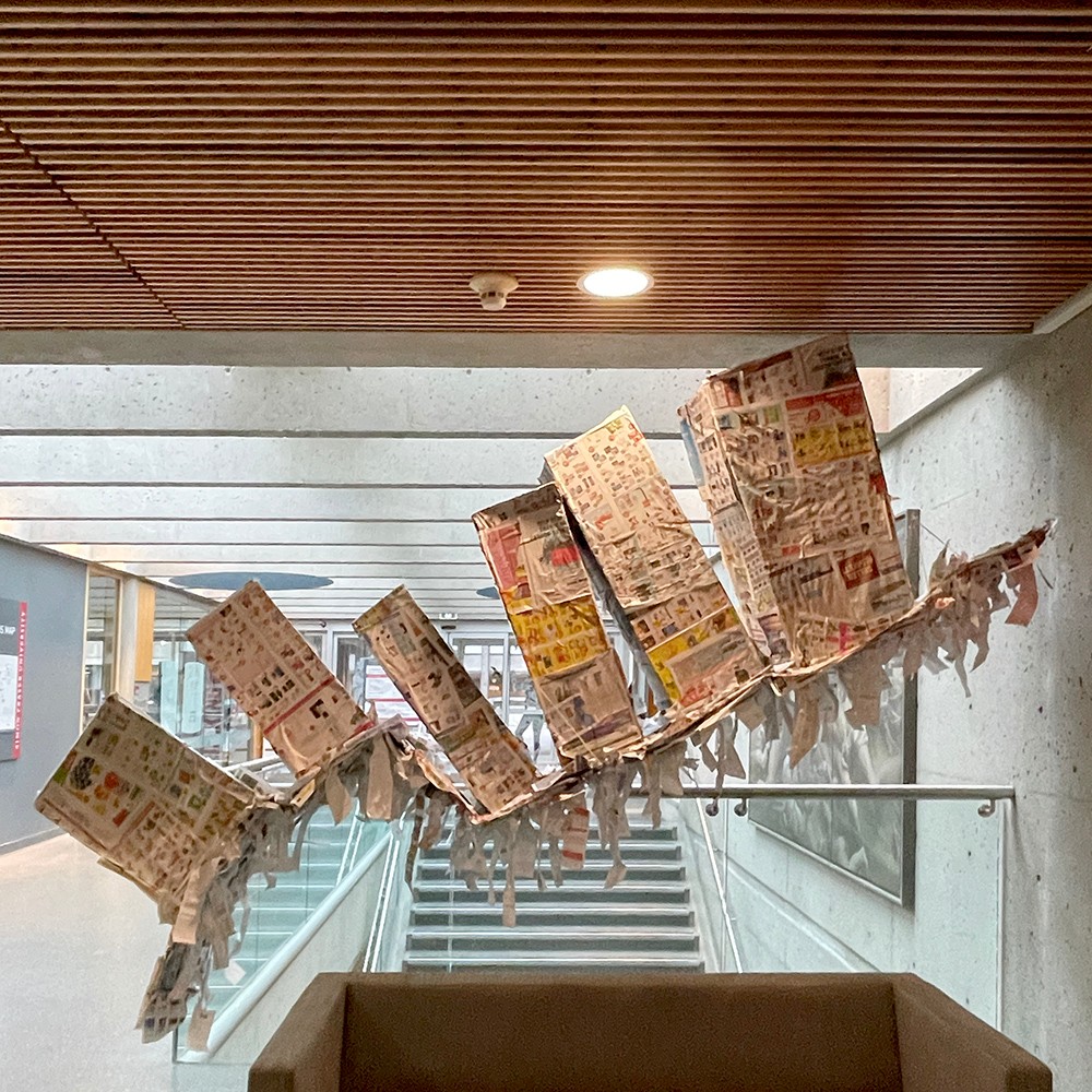
Tree
Reconstructed western red cedar. Cardboard, newspaper, glue. Western red cedar trees are native to the temperate rainforests surrounding Burnaby mountain. Their average lifespan is about 1000 years, and they grow upwards to 60 meters tall and 8 meters wide. The art object sits separated into four sections, bringing awareness to its creation. The reconstruction of the tree from its original live form, into paper, and back into an icon of a tree represents a process of destruction, production, and replacement; this process is also visible within the history of the construction of the SFU Burnaby campus in 1965. The intervention into the space questions the history of the destruction and production of Burnaby mountain, as well as ongoing government projects such as the trans mountain expansion project.

9 ___ Amy Dai
If everyone starts with a piece of paper and evolve twist. and shred and fold and strip and turn Walking in a dusty dream. Below the sky Some fly off to otherland, Some stays firmly Some starts molding… click. Splash. Plop! Soaked dreadful but maybe relaxing clear calm energized Burnaby Campus is one of the major campuses at SFU. The crowds of students striving through the hallways, aiming to achieve something hinted me my topic about learners and the beacon of light that will show us direction. This is an installation artwork made with paper materials like cardboard, drawing paper and wax paper supported and decorated by beads, fishing lines, and bells. We all are people who want to be stronger, but yet we are all different. When we look at others for help and for reference, we may not get the right thing we need because we are all different. Burnaby Campus has many stairways and and different levels of grounds. People standing and walking in different spots at Burnaby Campus is like people at different spots in their life. Even though everyone is different, and may have different things to overcome, the educations and experiences will help you. A Beacon Bell acknowledges the uniqueness of people and also symbolizes a light to keep in mind; a signal towards happiness.
10 ___ Abroop Dhami
There is a feeling that can be ascertained by our generation, the feeling of “I ’m actually on the wrong planet.” That feeling can subdue itself with the little things that we do as people out in the world, for someone like myself; it’s great when I’m in my garden, but the minute I go out the gate, I think, ‘What the hell am I doing here? This thought is why the piece I made represents that little piece of the garden in my mind. A world that contains a focus on the material can be immaterial. This thought process led to the material choices of wood being the only natural element in the piece, with the rest in plastic. The stool is there to place yourself into the work, a way to relax. To be surrounded by an aspect of my mind, however material the representation was. Its relation to the world, being placed in its spot, comes from the inability to be content while surrounded by what should be a natural vista.
11 ___ Karel Feng
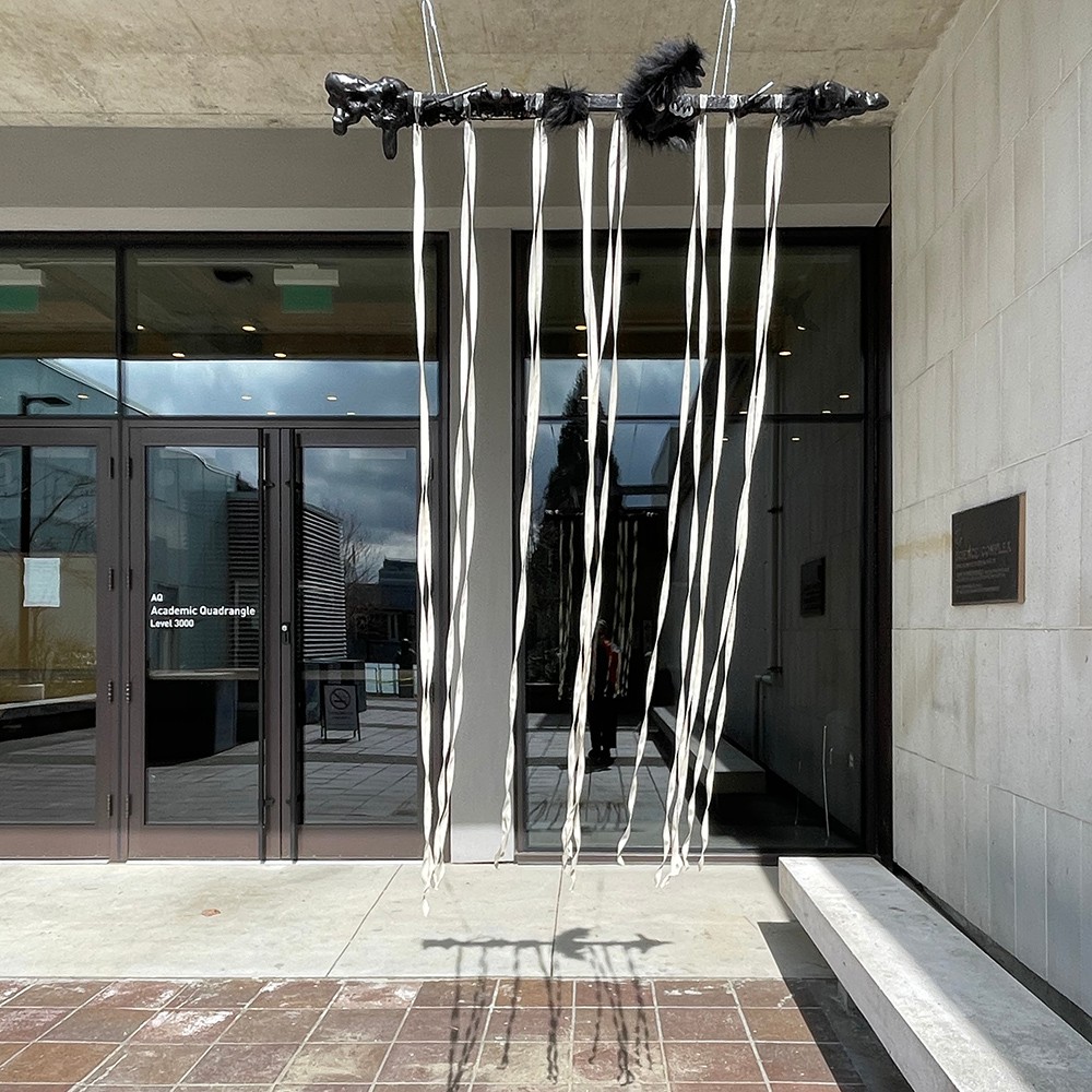
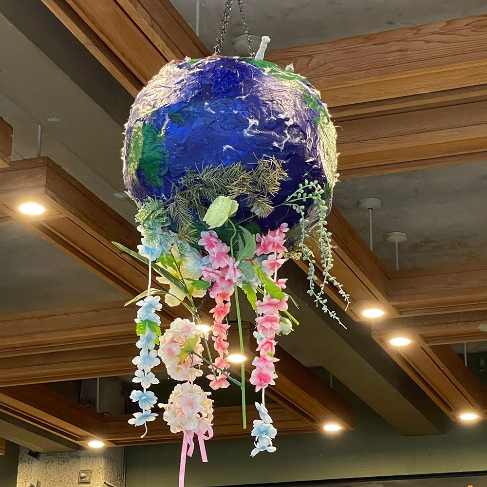
what we lost because of the WAR
The theme of my work is "against war". I want to make a statue work so that when the audience sees it, they can understand the content and thoughts I want to express. As human beings, we live together on this beautiful planet - Earth. For a modern country, war is harmful and not beneficial, it has no glory, and it will not bring prosperity to the country. Because before you win, the whole is destroyed. War brings nothing but madness, hatred, and even destruction. It tells you with countless lies that your actions are righteous and that everyone you kill is for the survival of the country, including adultery and looting. War has brought loss of human life and caused hatred among nations. It will destroy the ecological balance, pollute the environment, destroy human civilization, and destroy economic development. After the war, people's spiritual wounds will be difficult to heal, and it will take a long time to mend. In conclusion, when we are blinded by immediate interests and wage war, the earth we live in is already riddled with holes. Beautiful things (flowers) stay away from us, and it's too late when people regret it. The materials I chose were all very light as I needed to hang it up. I had never made a statue of a similar size before, and I made it as much as possible using materials I could find in the studio. I'm better at coloring with paint, so it's easier when I paint the globe image. I chose this theme because I think war is about all of us. It is very likely that someday in the future, the cozy campus where we are now will also be at war, and the place where we live every day will be turned into wreckage. So I want to take this as a warning to everyone.
12 ___ Gracy Gandhi
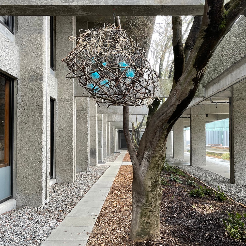
Haven
My artwork was materialized by compiling a mixture of both natural and manmade materials and drawing inspiration from Tadashi Kawamata’s style of clustering like materials. My artwork “Haven” was inspired by the the nest formation of a local British Columbian bird called the Oriole. Drawing inspiration from a bird that is native to BC was essential to my site of choice, as I am representing the land in which that creature occupies through my artwork. The mix of both natural materials that are free of human modification, and uniform wooden structures created with the skewers correlates with the site of my choosing. The area which my artwork will inhabit intersects with both man made concrete structures alongside natural vegetation, and represents both the qualities of these structures. The message I wanted to convey with this artwork was the importance of community, and how help from others can assist in a greater end product. With the assistance of the community around me and materials from my environment I produced this sculpture, and without this assistance of these people I wouldn’t have achieved the same end product with my artwork. For example, one of my classmates assisted in the collection of the sticks. The hands hugging the nest emphasize the feeling of safety, nestling the family of blue tufts. Moreover, I applied materials from majority of SFU’s campuses and my home to reflect the different areas of my community and further express who I am and where I spend my time.
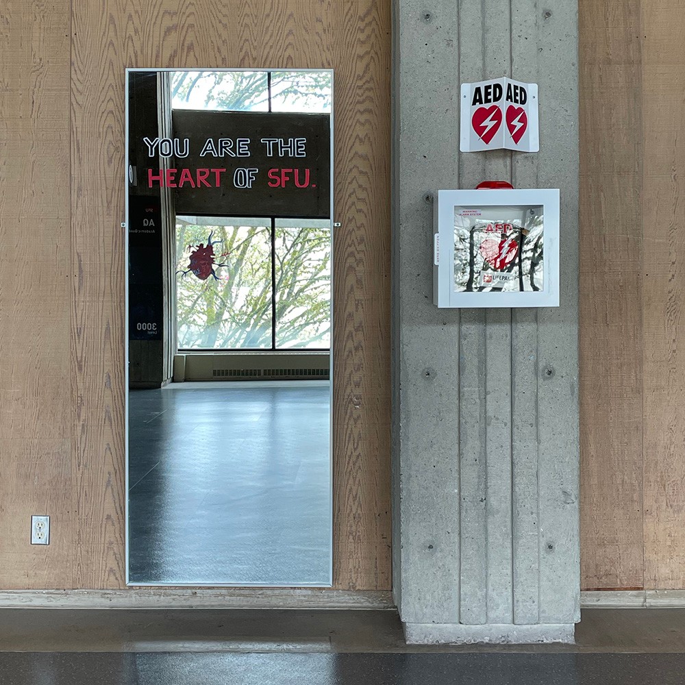
13 ___ Sana Goel
Vibe
This sound and visual art installation was inspired by the bustling crowds and energy of the Academic Quadrangle in Simon Fraser University. Designed more than 50 years ago by architects, Arthur Erickson and Geoffrey Massey, the AQ is the ceremonial heart of the campus at SFU anchoring various other buildings.It is a live, active space that students use to socialize and learn. As much as the physical architecture of AQ defines a certain character of the campus, it is the students that build the identity of SFU. It is the studentsthat make the campus come alive. With this site-specific piece, I wanted to capture that vibe and energy with AQ as a heart, the hallways as the veins and arteries and the students as the heartbeat. This is a mixed media art piece that invites interaction using a mirror, a physical decal, a mix of lettering and painting on the mirror and an accompanying sound. The “You are here” decal on the floor invites one to stand at that spot, triggering the infrared motion sensor that plays the sound of a heartbeat, a deep and continuous thumping. And as the participants listen to the heartbeat; they see themselves in the mirror with a painting of a heart in the spot where their actual heart would be. They also read the words, “You are the Heart of SFU”.
14 ___ Luvz de Guzman
Timestamp: Dawn, Day, Dusk
The concept of this piece centres around the perception of a space vs the intended use of it. Those two ideas can align, but interest blooms when the two ideas juxtapose. The artwork is inside a place of study because of the perception students would have of it, as well as the high concentration of students that would be visiting the area. While this space accommodates students with specific elements that make it easily accessible and allow students to concentrate on work, a perception of the area from a student can ultimately mold what the space is. A study space that welcomes students to use could become one that students may want to actively or subconsciously avoid due to feelings of stress or anxiety they garner inside the study area, therefore the perception of the space is molded in internal association. The three multimedia paintings, Dawn, Day and Dusk reflect on the shifting of students in relation to the passage of time, both externally and internally. Each painting represents three significant times of day, and the colours of the sky shift as the painted, cardboard floral symbols rises and falls. It is interactive, asking students to leave a time stamp of their moods or thoughts under the time they come across the piece. The floral-like symbols change according to the times of each piece, the peak of “bloom” visualizing inside the Day work. Whether or not the piece is interacted with in the intended way is decided by the students that look upon the works.
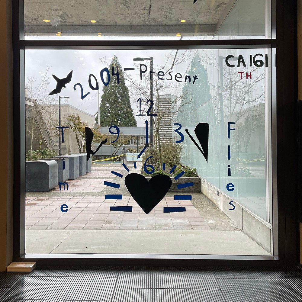
15 ___ Tracey Ho
A Point of View
“A Point of View,” is my 2-dimensional vinyl artwork on a glass window inside the AQ. The window serves as a ‘canvas,’ site on which my vinyl artwork will engage the attention of passersby. My project includes hand-drawn images of a heart, a clock, and two silhouettes that represent my welcoming personality. The words: “2004-present” is my current timeline as a young artist and “time flies,” prompts the audience to reflect. The title of my piece “A Point of View,” encapsulates the idea that time is universal and reminds us that our past and future are impacted by how we choose to spend our present time. It is a gentle reminder to slow down and be grateful for what we take as granted. The window strategically faces part of the AQ gardens and the Mahatma Gandhi statue, allowing passersby to appreciate the beauty of nature and reflect on SFU values of sustainability, diversity, and humanitarianism. The heart and clock emphasize that time is undervalued in our fast-paced lives. My silhouettes and the words “time flies” are peripherally located so that they do not clash with the center pieces but enhance, interpretation of the art piece. A measuring tape and fine-tip marker were used to center all art pieces and achieve symmetry as best possible to make maximal use of the window. My hope is that passersby will use this artwork as a backdrop for selfies to experience momentary gratitude during exhibition week.
16 ___ Ocean Hongphankul
Once upon a time, at the ping pong table
The artwork "Once upon a time, at the ping pong table" exhibited a life-size scale of the ping pong table that was composed of acrylic paint on canvas cloth that showcased the symbols that represent four countries: Thailand, Vietnam, Myanmar, and China. Symbols such as temples, lotus flowers, wheels, and elephants are the symbolism of Thailand. The longyi (လုံချည် )—-Myanmar’s national costume—-pattern can be optically discerned in the centre of the work through the use of a colourful and refulgent colour palette. Other symbols, including Chinese lanterns, dragons, Vietnamese coins, etc., the representations of Vietnam and China, which verbalise my own nationality and the culture I grew up in. The relation to the site is that the work is composed out of cloth so that it can act like a cover to protect the pingpong table from dust and rain that might damage it in the long term. The intention of creating this artwork is to showcase the community in the pingpong area that sanctions me to meet incipient people and engage with new environments, and that's what I spend most of my free time doing. Thus, making everything that was in the artwork was all the things that shaped me into who I am today.
17 ___ Julian Injeti
Work in Progress
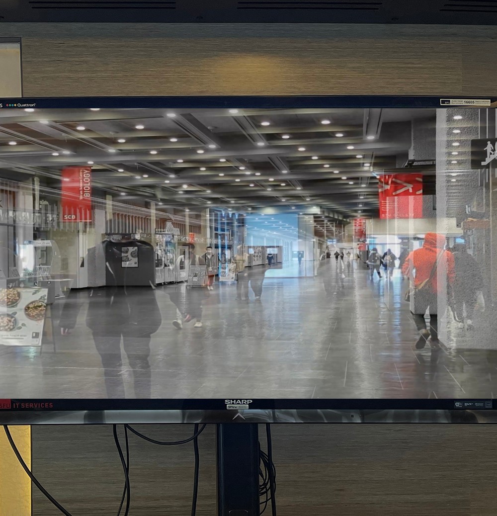
The idea behind this piece was to involve everyone and create something together. The whole project was based on the philosophy of Tabula Rasa, which means that one must gain knowledge through experience and perception. This whole project is based upon the experiences of fellow SFU students at Burnaby. This project is meant to evolve overtime as more students share their thoughts and experiences throughout the time period of the exhibit. This is a digital/performance piece. The animation that is projected was made with 207 layers in Procreate and will be projected onto a TV via Macbook through an HDMI port and will also be accompanied with stills captured by my friend Max.
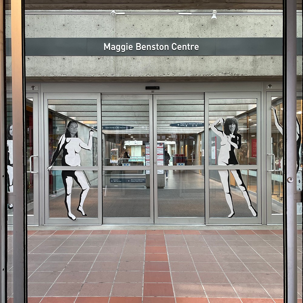
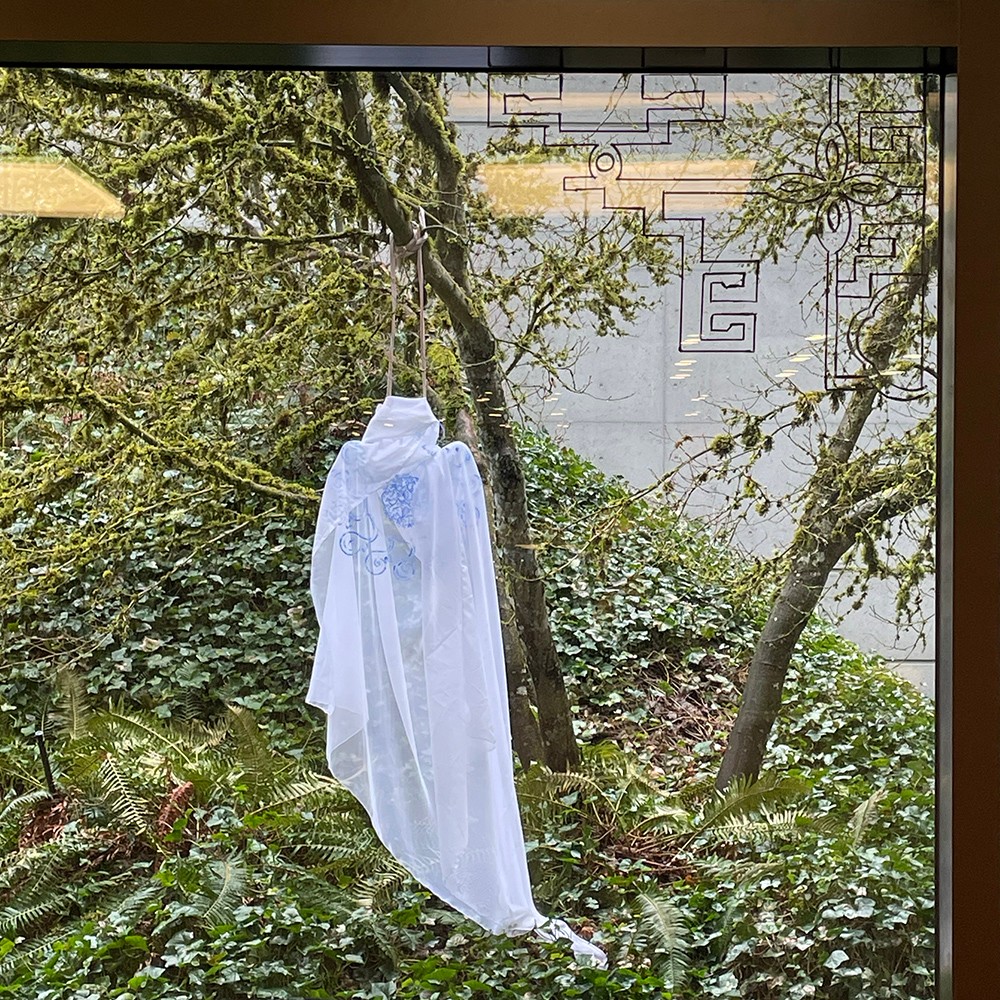
18 ___ Lauren James-Davies
Their flame will not go out
The Installation ‘Their flame will not go out’ consists of four life sized posters commemorating Margaret Benston, Andrea Lebowitz, Melody Killian, and Frances Wasserlein. These four women made up a portion of the members of Simon Fraser's Universities Vancouver Women’s Caucus, one of the earliest women's liberation groups in Canada. Founded in 1968, This group went on to crusade for universal equality, childcare services at SFU, women’s rights, and are well known for initiating the Abortion Caravan in 1970 which shut down Canadian Parliament for the first time in history. In current times, the abundance of diverse female faculty members, students, and staff at SFU are living testament of the Vancouver Women’s Caucus’ struggles and carry the torch that these women ignited. The backside of these posters are collaged with pages from ‘The Pedestal’, a newspaper created by the Vancouver Women’s Caucus. Images of Maggie, Andrea, Melody, and Frances from their youth can be seen on the front. Apart from the name Maggie Benston, these women and their stories have become invisible within SFU’s history. This can be attributed to a common phenomenon where women tend to be forgotten, romanticized, or allegorized when history is written. ‘Their flame will not go out’ was created to make the invisible stories of these women visible once more. These Posters are installed on the windows of the main entrance into the Maggie Benston Centre. This is an intentional act to force viewers to confront these women and in doing so confront the true history of Simon Fraser University.
19 ___ Carmen Kors
Unification
My drawing style was developed while reflecting on the nature of ancient stone buildings, and how the mortar between the stones erodes leaving only a wall of rocks, precariously placed with huge cracks between them. The lack of lines removes the preconception of boundaries and permanence, forcing the viewer to look at the image as the sum of its parts, rather than one object.
20 ___ Lily Le
Towering Realities
In this day in age, economic inflation has unrealistically climbed in numbers resulting in many necessities such as food, water, and gas prices to rise. As a result, this project will further discuss inflation’s effects through a juxtaposition of Cao Fei’s idea: fantasy vs reality in sculptural form. In doing so, the idea is to imagine: “inflation as an engulfing entity that suffocates one’s future”, the viewer is meant to be part of the work as the submissive individual can cower under the graph creature. In order to achieve the site-specificity condition of the artwork, the work comprises a compelling irony from the fixations of other locations inside the building. Such that the artwork discusses the daunting features of economic inflation, which in turn provoke shops, vendors, and the community about the immaculate stress that inflation impacts lives within a capitalist world. As such, the project focuses on the analysis of modern life financially aiding to what Kwon describes, “...the art work's relationship to the actuality of a location (as site) and the social conditions of the institutional frame (as site) are subordinate to a discursively determined site that is delineated as a field of knowledge, intellectual exchange, or cultural debate…” (Kwon, 1997).

21 ___ Kari Li
Intact
This artwork relates to the struggles in our contemporary world and how it reflects our society. The cracked mirror is supposed to represent an "intact" piece, just like us. We carry our own burdens and pressures that resemble a screen protector, even though we crack due to our pressures we must stay intact, there is no time for us to fall apart because there's so much to worry about in our lives.

23 ___ Angel Lok
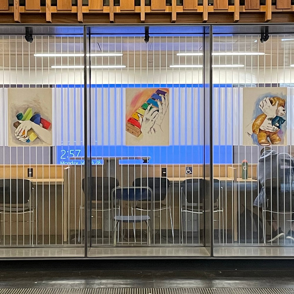
BOOK PAINTING, SHADOW COLLAGE, HOARDER
A set of poetic instructions made with acrylic paint on three 18x24 canvases that function more like prompts hung up on walls in one of the study areas in the Academic Quadrangle. These pieces are meant to inspire creativity and motivation within students at SFU and/or to offer them an opportunity to remove themselves from their schoolwork and engage with a piece of art instead. There are no strict regulations on how to respond to the piece— they may imagine it in their head, realize it with their own materials, or create conversations around it with someone else.
24 ___ Daniel Molnar
Crude Memories
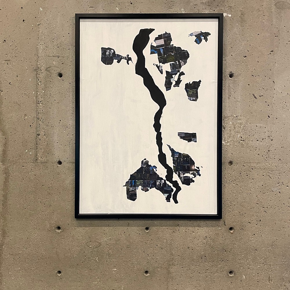
The TMX pipeline was commissioned to run through Burnaby Mountain, destroying wooded areas and creating a dangerous environment risking leaks and fires. The extension has been heavily protested by SFU students, and citizens of Burnaby Mountain alike, raising awareness to the upcoming danger. Crude Memories (2022), explores a contemporary methodology of raising awareness to this issue. The outlines include the Athebasca river running through the canvas, and a bird's eye view of the Athebasca tar sands, a major producer of Crude Oil. The shapes of these mines are made of polaroid style images of nature on Burnaby Mountain, and collaged together. Polaroids are often seen as ways of producing memories, and thus the piece produces a sense of times past or memories. The work is created for viewers to understand that all these natural beauties that we see around us, and often take for granted, could be gone with both the deforestation for the pipeline itself, and if the pipeline leaks or starts a forest fire. The individual photos are collaged onto the imperfectly painted canvas with wheatpaste, which creates a public poster texture, suggesting that the piece should be regarded as a public announcement, rather than just an art piece that belongs within an art gallery. Additionally, the faulty paint job, and irregular collaging suggests an imperfect sense to the work, this can be related to how nothing is perfect in Nature, which provides an irregular beauty.

25 ___ Harvir Nahal
Kamal
The concept for my work is a water lotus. The materials used for this sculpture are single use cups, cup lids, yoghurt containers, container lids, various colours of spray paint, water-resistant sealant, and hot glue. Water lotuses represent self-regeneration and rebirth in many Asian cultures. Regardless of their environment, they usually produce a flower and are very hardy. Nelumbo nucifera is an invasive species of water lotuses and can reproduce very quickly in shallow water, hence the placement in a shallow pond. Represents the growing population of Asian students at SFU and the change in the majority and minority groups. This species of lotus is also known as Indian lotus. Being an Indian woman myself, this installation is a representation of students who are immigrants or second-generation immigrants who came to Canada and don’t feel like they fit into western culture. Inspired by Michael Rakowitz and his technique of repurposing packaging and single use items to create meaningful and culturally rich work. There have been water lotuses/lilies in the pond before but now it is murky and littered with masks and other garbage. The idea behind making the water lotuses out of single-use cups was to show nature being taken over by pollution. Most importantly, the pollution of our learning space, that is supposed to be clean. It is an area of the campus that is sometimes overlooked because there is nothing eye-catching about it. SFU takes pride in their AQ pond, and my goal is to restore that.
26 ___ Haruomi Nakajima
Waiting For Something to Happen?
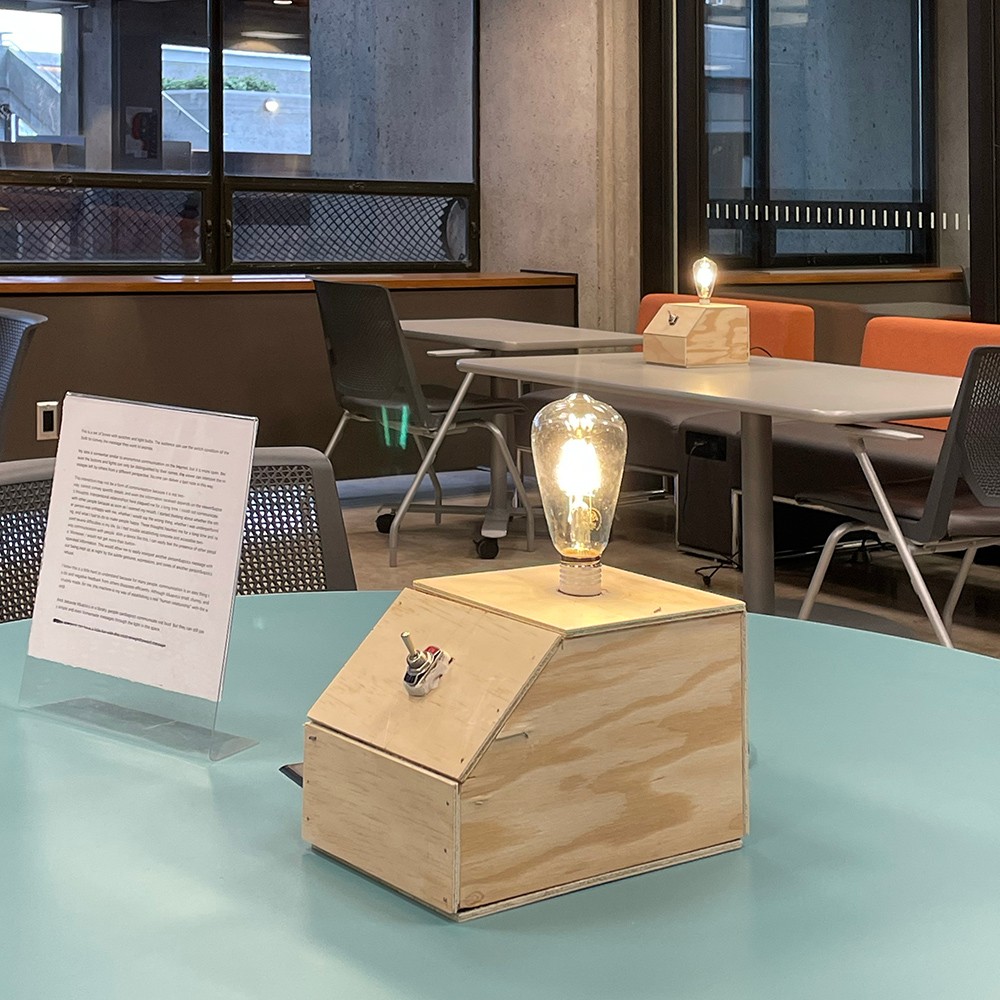
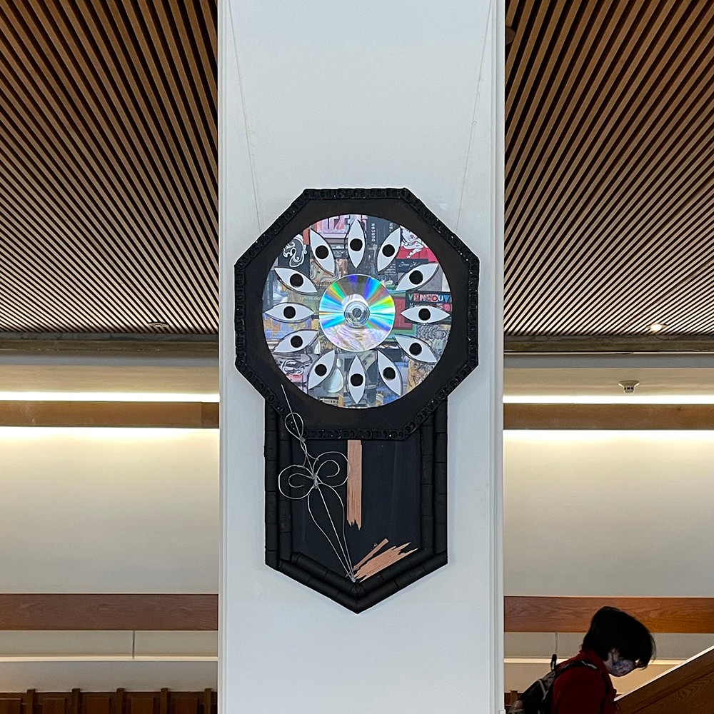
“How am I supposed to be “original” when I’m constantly being influenced by art around me?” As an artist, I ask myself that question everyday, trying to be “unique” and “distinctive”, but fail to achieve that from the overwhelming amount of mass media consumed. I have lists after lists of pre-existing art pieces and media that motivate and inspire me to create, yet ironically enough, they are the exact same pieces that prevent me from creating art, as I fear the notion of being too reliant on others. A pendulum clock made from a wood panel was used in this piece to symbolize the claustrophobia I feel from the anxiety that the time I spend doing nothing will never be brought back, and the fear that I won’t be able to achieve anything that I could be proud of within my youth. Two clocks hang in opposition to each other in one of the busiest hallways on the SFU Burnaby campus, which is metaphoric of my internal dilemma of constantly comparing myself to others around me that I feel covetous for their achievements. The title, Waiting For Something to Happen? is taken directly from a line of dialogue in video game developer and indie art studio OMOCAT’s hit 2020 RPG game OMORI. I wanted to, again, create a sense of irony in my piece that touches on individualism, and name it after a pre-existing work that I took influence from.
27 ___ Cloe Ng
Faces
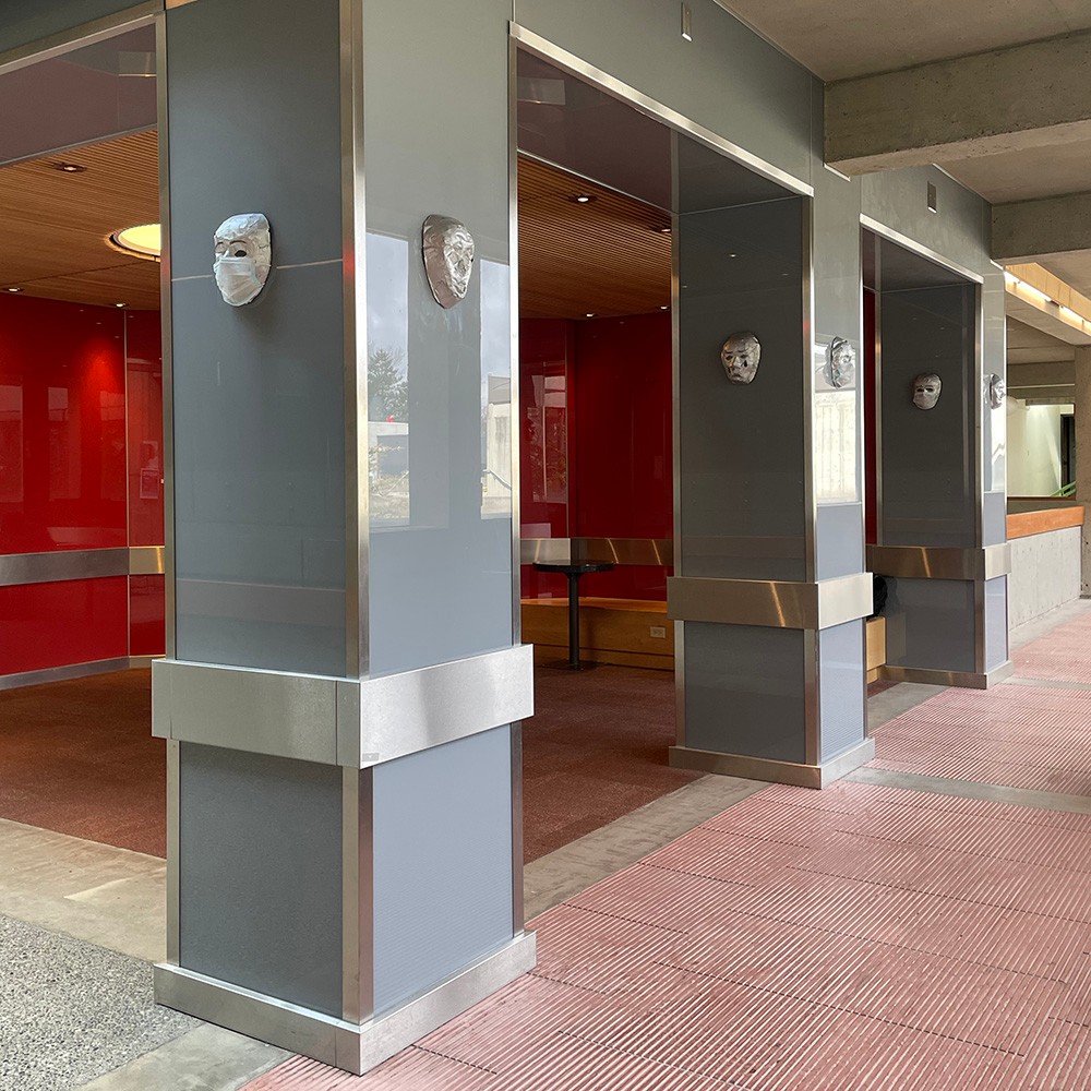
This piece is 12 masks wearing masks. They are made of paper mache with sculpted facial features and painted with silver paint. They are all wearing thin masks to make it easy to see the expressions underneath. It's to show people wearing masks emotionally and physically. Six out of the twelve masks have no emotion while the other six have overdramatic facial expressions similar to those theatre masks. This is to comment on covid and how the mask and the pandemic have affected us. It has affected us by letting us hide half our faces and making us use our eyes and eyebrows more to express our emotions now. This is the physical aspect, the emotional aspect, is how some people wear an emotional mask to hide who they are or how they feel. People can act and seem happy when they’ve put up an emotional barrier and are sad on the inside. They act like they are something they're not by putting these masks they've created. The mask is near the Image Theater; the piece relates to the site because it uses the theatre mask as a base with the over-extracted expressions. As well, acting like someone you arent and putting a mask on is similar to what you do at the theatre when you put on a play or production.
28 ___ Sarah Robinson
a reflection of what could be
A reflection of what could be mimics the surrounding landscapes of the Burnaby Mountain campus through the use of repurposed broken glass on plexiglass, secured by a layer of resin. The use of plexiglass is to help light pass through and have the shards of glass be reflected across the concrete campus landscape. Located in the window of the AQ south side, the vivid colors of glass bring life to the space itself, along with the institution. Following influence from Gordon Smith’s “Mosaic Mural”, a reflection of what could be uses a mosaic styling that features organic shapes defined by their vibrant colors. The blue sky with streaks of a sunset fall behind the green hills and mountains. A reflection of what could be symbolizes that of a window, as if looking through into a fragmented reality. This reality speaks on the idea of natural lands and how colonization affects these environments. Each individual viewing of this piece will have a distinct experience depending on the time of day as well as at what angle the light collides with it, all resulting in a unique encounter. Consider what you see and how your own perception can change in another light.

29 ___ Moay Sakata
[REDACTED]
Back when the artist still took classes at Burnaby campus, she felt like she was operating on autopilot: outside of herself, fully disconnected from her studies, from her peers, from her environment. For her, the daunting grey architecture of the campus, the coldness and lack of connections in its spaces, and the sharp lines found in its every corner have come to be the visual synonyms of this very unhappy period of her life. Harnessing these visual elements, as well as camera movements and sound effects that have uncomfortable connotations, [REDACTED] is the artist’s attempt at an audiovisual articulation and simulation of her campus experience. Principally, it exploits peculiarly angled handheld shots that move erratically, both in order to make the piece feel like a personal experience through the campus as well as to distort once-familiar scenes of the place into a novel, inescapable maze. The piece activates the video medium’s indexical quality (i.e., the common understanding/assumption that photographed objects and events truly existed and occurred in the physical real world), its inevitable time dimension, and its hegemonic editing conventions in order to draw a nonlinear map of the campus. [REDACTED] challenges the assumed neutrality and innocence of a place, and it aims to create a moment of connection and solidarity between student spectators who might resonate with and relate to the piece’s feeling. Vocal credits: Emma Campbell, Caroline Chernega, Claine Lamb, and Moay Sakata.

30 ___ Renan Shao
Inner space
This project incorporates light, transparent material and natural collection from campus such as pinecones, pine needles, dried leaves and grass that fill up the inner space in each individual pocket. The pockets are made with transparent vinyl sheet filled with natural, mostly native materials found on Burnaby campus. The pockets are cut into equal square shapes separately before attached together into one piece. Each individual square sheet is hand sewed to indicate the independence of the natural, hand crafting process. The initial idea of this project takes reference from Lycia Clark’s use of the plastic nets. In one of her works “Abyss Mask” she breathed through a large tube-like plastic net with stones weighted at the bottom of the net. The work as I interpret, is a way for her to interact with the environment. In my project the large vinyl sheet when attached to the metal frame will eventually interact with its natural surroundings - wind, sunlight, seasonal change etc. Clark incorporated materials like stone, air, and water - natural materials as I use in my project to resonate with her idea. Another artist I use as reference to my project is Yuji Agematsu. His assemblage-style sculpture with materials collected during his walk in NY reflects on the environment of the area he lives in. I referred to his idea and applied the concept in relation to Burnaby campus to make my project site specific, to reflect the natural attributes of the campus. The different combination of the materials - color, texture and size collaborate to form a surrounding around the inner space of the vinyl pouches.
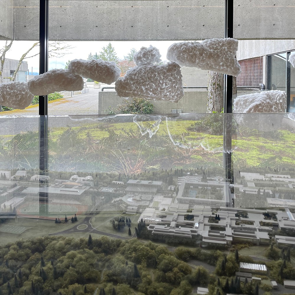
32 ___ Stephanie Shih
Considering the climate on the Burnaby Mountain is always cloudy or foggy. It creates a contrast of the indoor and outdoor. Students within the building are “trapped” just like the fog outside the building. They also share similarities, the fluidity of the crowd and the fluidity of humidity, which is the major factor in fog/cloud formation. The location will be by the SFU campus model table. Making the model to be more authentic.
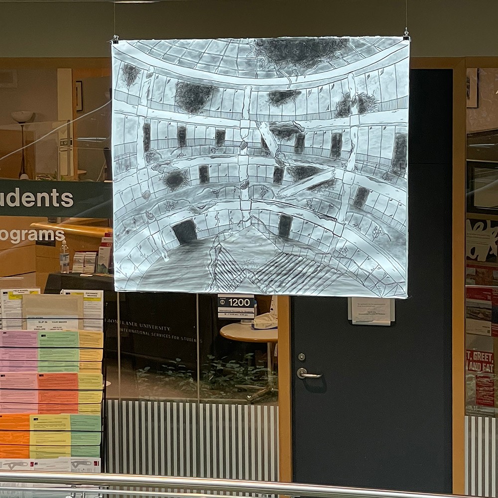
33 ___ Caelan Thorne
Ruins
My piece is a large 40 by 34-inch drawing. The image’s materials include ink, charcoal, black pen marker, paper, and aluminum foil. For the project, I wanted to keep the image to a large scale, bringing attention to the artwork making it more noticeable from afar, enticing people to look closer and find details. The black and white colour palette gives a more bleak and dystopian feeling to the architecture. I positioned aluminum foil on the backside of the artwork to reflect the space back at whoever views it while also adding to its noticeability. The fisheye perspective in the piece is used to make the image more intriguing and capture a larger frame. My artwork directly relates to site-specificity through redrawing a location in a way that gives the space new meaning. The image takes place in an abandoned, post-apocalyptic future that makes the viewer question what could have happened to have it become like this. I kept the main architectural structure, making the area recognizable while also altering parts to show the passage of time and potential of disaster, for example, the collapsing of pillars and breaking of glass. The piece should be left up to your own interpretation as to what could have caused the destruction of the building.

34 ___ Novejit Virk
Radiant Rings
Radiant Rings focus is on the vivid and bright colors of the work. Inspired by the Mosaic Mural by Gordon Smith, I decided to create something as a response with similar concepts and elements, but have it look vastly different. The idea for my artwork came after we visited the Burnaby campus earlier; I realized that when I entered the art gallery there, it felt very lively with the orange wall. However, that feeling was not found throughout the rest of the campus. The overall look of the Burnaby campus is very dull and cold therefore, I decided to incorporate lots of lively colors into my work using the same color scheme as the Mosaic Mural. Moreover, the campus structure is very rigid and concrete with all the architecture consisting of straight and harsh lines. I represented those lines with the yarn that connects to the rings made from PEX pipe and the fabric then comes to break that sharpness and add in a bit more fun with the organic shapes and placement of the screen-printed fabric. The light weight of the work will allow it to sway and rotate smoothly which again breaks that stiffness in the overall look of the building. This installation will be hanging by the Student Union Building and fits in perfectly with the colorful lined ceiling of the building, both the new building and artwork end up complimenting each other. Radiant Rings is responding to the campus site in an opposing way, just like the Mosaic Murals, in terms of the look and feelings the building evokes within students.
35 ___ Daniel Walberg
Connection
This video installation started with the idea of connection; how every student in this school is connected through the hallways and classrooms they pass through and I wanted to show that through this. It is often that we forget as students that we all are in school together and though many of us are learning many different things, we all have the same goals in mind. I chose the academic quadrangle because that part of the entire building has the most students connected together through different majors so the difference in students is prevalent. To film this artwork, I used a Google Pixel 6 because as a filmmaker, you should use what you can to film, rather than worrying about having the best rigs on the market. I shot at both normal and fast speeds and I edited it all on Adobe Premiere Pro. Every shot I used, I crossfaded them into one another to simulate one continuous shot and to simulate many students in the same area passing by. All of the fast-speed shots I made black and white to convey how fast time can feel and how these moments of connection can go by very quickly. The entire video is 3 minutes and 26 seconds long and is on a constant loop. I started and ended the video with a crossfade to make the loop feel natural.
36 ___ Evelyn Wang
Oriental Memory
Inspiration comes from the classical garden of Suzhou, China. There is a landscaping technique about the garden architecture called 移步异景 (one step one view). It means that as the tourist’s observation point changes, the scenery they see also changes. And the windows with traditional patterns are an important part of the landscape building. The window itself is a scenery, from the window to see the different perspectives of the outside is also a scenery. In addition, water/ lake is a significant part of the site. Using soft fabric materials to represent the flowing water. Reflections in water are always associated with illusions. So the texts embroidered on the organza are from ancient Chinese legends called 洛神赋 (ode to the nymph of the Luo river). The poem describes the poet’s imaginary romantic encounter with the nymph, or goddess, of the Luo River in central China. They fall in love but eventually part with one another. So the poet wrote this poem. In fact the goddess is only a figment of the poet's imagination. I use this poem to express the illusion of the water.

37 ___ Freya Zan
Staccato #1
There is a piano located on the roof at West Mall Centre I noticed when the first time I went there. As we know the students in that building mostly major in Business, Economics, Food Services, etc. I wondered why there is a piano on the roof seems like for music major students, then I do some research about that piano and got some information that the piano was donated by an art organization, and the sounds of that piano serve as a delightful reminder that life exists outside of academia, and people have all different talents which extend beyond what is strictly necessary for university. People playing piano add joy to others’ lives and fill the air with sound which brings a constructive way to vent creative energies, without the pressures of (one could even argue that this is helped by the broken keys). And for the material I chose were inspired by Andy Amholst, his works about those music pages were two-dimensional structures put together like a building on paper, which reminds me of “music is moving architecture” So my artwork use different types of wire to create a music page with some notes flowing from the music sheet into the air because the wire is a flexible and heavy material, it can fold the shapes of different notes, and the wires stacked together like the marks of piano practicing on the music sheet. And the reason I am hanging the page from the second-floor railing near the piano that the audience may not see the piano directly is that it is a metaphor of music that comes out of that piano are fill the air and surrounds the campus with students.

38 ___ Xinyi Zhao
Idea From The Mountain
My inspiration is an artwork on SFU Burnaby campus, Buell Mullen, Theaters of The World (1964-65). According to the survey, this artwork is characterized by the use of a variety of metals, stones and jade and also their reflection, various geometric shapes make it full of interest. My project is located in a place where people can see the mountain on the SFU campus.The most important part of the project will consist of a "mountain" composed of Wire, string and wool,. It needs to be the same as the real mountain seen by people, because it represents SFU. The "mountain" in the works corresponding to the real mountain makes it a unique work that only appears in a specific position. The mountain part in my work is very "bionic". In order to add natural atmosphere, I choose the most suitable wool to make it have the color and visual feeling of the land, and add a lot of wool representing plants. It makes it look not bare, full of life, and makes it fit my subject. And other improved materials collected are connected by lines, which represent various ideas and thoughts generated by people through learning and living here. They are in different materials and shapes, but they are all around "the mountain", connected and collided with each other. This is a work that visualizes SFU campus and people's creativity and thoughts.
